These are code snippets and notes for the fifth chapter, The Many Variables & The Spurious Waffles, section 1, of the book Statistical Rethinking (version 2) by Richard McElreath.
This section was quite dense, so these notes are a bit more detailed.
Spurious Waffles (and Marriages)
In this chapter, we’re looking at spurious correlations and how to think formally about causal inference. For this section, we’ll work with the waffle-divorce data. The data contains the divorce rates of the 50 states of the US and various variables that could be used to explain their divorce rates. We’ll focus on the two variables median age at marriage and the marriage rates:
library(rethinking)
data("WaffleDivorce")
d <- WaffleDivorce

# standardize variables
d$D <- standardize( d$Divorce )
d$M <- standardize( d$Marriage )
d$A <- standardize( d$MedianAgeMarriage )
We start fitting a model using quap() to predict divorce rates using the median age at marriage as predictor.
# fit model
m5.1 <- quap(
  alist(
    D ~ dnorm( mu, sigma),
    mu <- a + bA*A,
    a ~ dnorm(0, 0.1),
    bA ~ dnorm(0, 0.5),
    sigma ~ dexp(1)
  ), data=d
)
Some notes on the priors:
We standardized all our predictor variables, as well as the target variable. So if the (standardized) predictor variable \(A\) is 1 for one observation, then this observation is one standard deviation away from the mean. If then \(\beta_A = 1\), this would imply that we predict a change of \(+1\) for the target variable, and since this one is also standardized this implies a change of a whole standard deviation for the divorce rate. So to get a feeling of what would be a good prior, we also need to look at the standard deviations of the variables:
sd( d$MedianAgeMarriage )[1] 1.24And for the target variable:
sd( d$Divorce )[1] 1.82So a change of 1.2 years in median age at marriage is associated with a full standard deviation change in the divorce rate, i.e. the divorce rate increases by 1.8 divorces per 1000 adults. This seems rather strong which is why a prior of \(\text{Normal}(0, 0.5)\) is probably better fitted for \(\beta_A\).
We can also simulate from the priors:
set.seed(10)
prior <- extract.prior( m5.1 )
mu <- link( m5.1, post=prior, data=list( A=c(-2, 2)))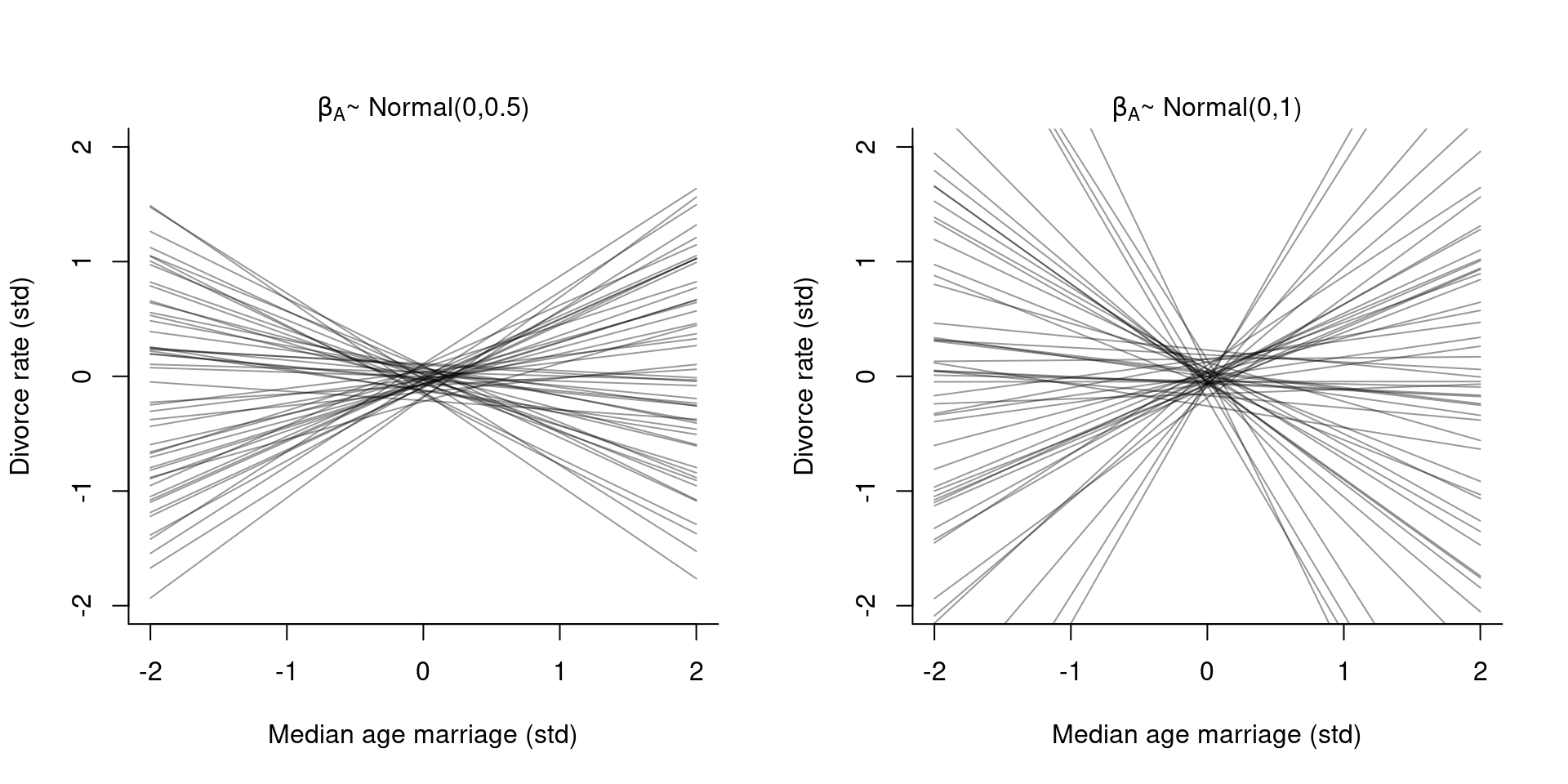
If we compare the chosen prior with a just slightly flatter prior (right plot), we can see how the results get extreme very quick.
Now, on to posterior predictions:
# compute shaded confidence region
A_seq <- seq(from=-3, to=3.2, length.out = 30)
mu <- link( m5.1, data=list( A=A_seq ) )
mu.mean <- apply( mu, 2, mean )
mu.PI <- apply( mu, 2, PI )

# plot it all
plot( D ~ A, data=d, col=rangi2,
      xlab="Median age marriage", ylab="Divorce rate")
lines(A_seq, mu.mean, lwd=2 )
shade( mu.PI, A_seq)
On the right, I’ve plotted the posterior predictions for a model using the marriage rate as predictor using this model:
m5.2 <- quap(
  alist(
    D ~ dnorm( mu, sigma),
    mu <- a + bM*M,
    a ~ dnorm( 0, 0.2 ),
    bM ~ dnorm(0, 0.5 ),
    sigma ~ dexp( 1 )
  ), data=d
)
We can see that both predictors have a relationship with the target variable, but just comparing the two bivariate regressions doesn’t tell us which predictor is better. From the two regressions, we cannot say if the two predictors provide independent value, or if they’re redundant, or if they eliminate each other.
Before simply adding all variables into a single big regression model, let’s think about possible causal relations between the variables.
Yo, DAG
A DAG, short for Directed Acyclic Graph is a causal graph that describes qualitative causal relationships among variables.
A possible DAG for our example would be the following:
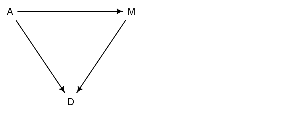
This means that
- Age directly influences Divorce rate
- Marriage rate directly influences Divorce rate
- Age directly influences Marriage rates
On top of the direct effect on the divorce rate, age of marriage also indirectly influences the divorce rate through its influence on the marriage.
A DAG itself is only qualitative whereas the statistical model helps us determine the quantitative value that belongs to an arrow. However, if we take our model m5.1 where we regressed \(D\) on \(A\), the model can only tell us about the total influence of \(A\) on \(D\). Total means that it accounts for every possible path from \(A\) to \(D\), this includes the direct path \(A \to D\) but also the indirect path \(A \to M \to D\).
But we could also consider other DAGs for our problems. E.g.

In this causal model, the association between marriage rate \(M\) and the divorce rate \(D\) arises entirely from the influence of age \(A\) on the marriage rate \(M\).
Both DAGs are consistent with the output from our models m5.1 and m5.2. To find out which DAG fits better, we need to carefully consider what each DAG implies and then check if the implications fit with the data we have.
Plotting DAGs
To plot DAGs, you can use the package DAGitty. It is both an R package as well as a browser-based tool. To plot the DAG from above, you write the following code:
library(dagitty)
dag5.1 <- dagitty( "dag{ A -> D; A -> M; M -> D}" )
coordinates(dag5.1) <- list( x=c(A=0, D=1, M=2), y=c(A=0, D=1, M=0))
drawdag( dag5.1 )
The function drawdag() comes with the {{rethinking}} package and it changes some par() settings. If you use base plot functions afterwards, I recommend to reset it to the default settings:
dev.off()It is a bit clunky to have to specify the coordinates manually for each node in the graph. There’s another R package that works on top of dagitty and uses ggplot to arrange the graph: ggdag. This way you don’t have to specify the coordinates and can also use ggplot’s functionality to further manipulate the graph:
library(ggdag)
dag <- dagitty( "dag{ A -> D; A -> M; M -> D}" )
ggdag(dag, layout = "circle") +
  theme_dag()
Does this DAG fit?
To check which causal model implied by a DAG fits better with our data, we need to consider the testable implications.
If we look at the two DAGs we considered so far:

Both of these imply that some variables are independent of others under certain conditions. So while none of the variables here are completely independent of each other but some of them are conditionally independent. These conditional independencies are the model’s testable implications. They come in two forms:
- statements about which variables should be associated with each other,
- statements about which variables become dis-associated when we condition on other variables.
So if we have three variables \(X, Y\) and \(Z\), then conditioning on \(Z\) means that we learn the value of \(Z\) and check if then learning \(X\) adds any additional information about \(Y\). In this case we say \(X\) is independent of \(Y\) given \(Z\), or \(X {\perp\!\!\!\perp}Y | Z\).
So let’s consider the DAG above on the left. In this DAG, all variables are connected and so everything is associated with everything else. This is one testable implication: \[\begin{align*} D {\;\not\!\perp\!\!\!\perp\;}A && D {\;\not\!\perp\!\!\!\perp\;}M && A {\;\not\!\perp\!\!\!\perp\;}M \end{align*}\] where \({\;\not\!\perp\!\!\!\perp\;}\) means “not independent of”. So we can take these and check if they conform to our data. If we find that any of these pairs are not associated in the data then we know that this DAG doesn’t fit our data. Let’s check this in our data:
cor(d[,c("A", "D", "M")])| A | D | M | |
|---|---|---|---|
| A | 1.000 | -0.597 | -0.721 |
| D | -0.597 | 1.000 | 0.374 |
| M | -0.721 | 0.374 | 1.000 |
Indeed, all three variables are all strongly associated with each other. These are all testable implications for the first DAG.
Let’s go and check the second DAG then where \(M\) has no influence on \(D\). Again, we have all three variables are associated with each other. Unlike before, \(D\) and \(M\) are now associated with each other through \(A\). This means, if we condition on \(A\) then \(M\) can’t tell us any more about \(D\). Thus one testable implication is that \(D\) is independent of \(M\), conditional on \(A\), or \(D {\perp\!\!\!\perp}M | A\).
We can also use {{dagitty}} to find the conditional independencies implied by a DAG:
DMA_dag2 <- dagitty('dag{ D <- A -> M }')
impliedConditionalIndependencies( DMA_dag2 )
D _||_ M | AThe same result as what we concluded manually.
For the first DAG:
DMA_dag1 <- dagitty('dag{ D <- A -> M -> D}')
impliedConditionalIndependencies( DMA_dag1 )
There are no conditional independencies.
So this also the only implication in which the two DAGs differ from each other. How do we test this? With multiple regression. Fitting a model that predicts divorce using both marriage rate and age at marriage will address the following two questions:
- After already knowing marriage rate (\(M\)), what additional value is there in also knowing age at marriage (\(A\))?
- After already knowing age at marriage (\(A\)), what additional value is there in also knowing marriage rate (\(M\))?
The answer to these questions can be found in the parameter estimates. It is important to note that the question above and its answers from the parameter estimates are purely descriptive! They only obtain their causal meaning through the testable implications from the DAG.
More than one predictor: Multiple regression
The formula for a multiple regression is very similar to the univariate regression we’re already familiar with. Similarly to the polynomial regression from last chapter, they add some more parameters and variables to the definition of \(\mu_i\): \[\begin{align*} D_i &\sim \text{Normal}(\mu_i, \sigma) \\ \mu_i &= \alpha + \beta_M M_i + \beta_A A_i \\ \alpha &\sim \text{Normal}(0, 0.2) \\ \beta_M &\sim \text{Normal}(0, 0.5) \\ \beta_A &\sim \text{Normal}(0, 0.5) \\ \sigma &\sim \text{Exponential}(1) \end{align*}\]
We fit the model using quap():
# fit model
m5.3 <- quap(
  alist(
    D ~ dnorm( mu, sigma),
    mu <- a + bM*M + bA*A,
    a ~ dnorm(0, 0.2),
    bM ~ dnorm(0, 0.5),
    bA ~ dnorm(0, 0.5),
    sigma ~ dexp(1)
  ), data=d
)
precis( m5.3 )| mean | sd | 5.5% | 94.5% | |
|---|---|---|---|---|
| a | 0.000 | 0.097 | -0.155 | 0.155 |
| bM | -0.065 | 0.151 | -0.306 | 0.176 |
| bA | -0.614 | 0.151 | -0.855 | -0.372 |
| sigma | 0.785 | 0.078 | 0.661 | 0.910 |
The estimate for \(\beta_M\) is now very close to zero with plenty of probability of both sides of zero.
plot( coeftab( m5.1, m5.2, m5.3 ), par = c("bA", "bM"), prob = .89)
The upper part are the estimates for \(\beta_A\) and the lower part the estimates for \(\beta_M\). While from m5.2 to m5.3 the parameter \(\beta_M\) moves to zero, the parameter \(\beta_A\) only grows a bit more uncertain going from m5.1 to m5.3.
So this means, once we know \(A\), the age at marriage, than learning about the marriage rate \(M\) doesn’t add little to no information that helps predicting \(D\). We can say that \(D\), the divorce rate, is conditionally independent of \(M\), the marriage rate, once we know \(A\), the age at marriage, or \(D {\perp\!\!\!\perp}M | A\). This means, we can rule out the first DAG since it didn’t include this testable implication.
This means that \(M\) is predictive but not causal. If you don’t have \(A\) it is still useful to know \(M\) but once you know \(A\), there is not much added value in also knowing \(M\).
In Matrix Notation
Often, linear models (that is, the second line the model above) are written as follows: \[\mu_i = \alpha + \sum_{j=1}^n \beta_j x_{ji}\] It’s possible to write this even more compact: \[\mathbf{m} = \mathbf{Xb}\] where \(\mathbf{m}\) is a vector of predicted means, i.e. a vector containing the \(\mu_i\) values, \(\mathbf{b}\) is a (column) vector of parameters and \(\mathbf{X}\) is a matrix, also called the design matrix. \(\mathbf{X}\) has as many columns as there are predictors plus one. This plus one column is filled with 1s which are multiplied by the first parameter to give the intercept \(\alpha\).
Simulating some Divorces
While the data is real, it is still useful to simulate data with the same causal relationships as in the DAG: \(M \gets A \to D\)
N <- 50                        # number of simulated states
age <- rnorm(N)                # sim A
mar <- rnorm(N, -age )         # sim A -> M
div <- rnorm(N, age )          # sim A -> D
We can also simulate that both \(A\) and \(M\) influence \(D\), that is, the causal relationship implied by the first DAG:
N <- 50                        # number of simulated states
age <- rnorm(N)                # sim A
mar <- rnorm(N, -age )         # sim A -> M
div <- rnorm(N, age + mar)     # sim A -> D <- M
How do we plot these?
Visualizing multivariate regressions is a bit more involved and less straight-forward than visualizing bivariate regression. With bivariate regression, one scatter plot often already gave enough information. With multivariate regressions, we need a few more plots.
We’ll do three different plots:
- Predictor residual plots. A plot of the outcome against residual predictor. Useful for understanding the statistical model.
- Posterior prediction plots. Model-based predictions against raw data (or error in prediction). Useful for checking the predictive fit (not in any way causal).
- Counterfactual plots. Implied predictions for imaginary experiments. Useful to explore causal implications.
Predictor residual plots
A predictor residual is the average prediction error when we use all of the other predictor variables to model a predictor of interest.
In this example we only have two predictors, so we can use \(A\), the age at marriage, to predict \(M\), the marriage rate: \[\begin{align*} M_i &\sim \text{Normal}(\mu_i, \sigma) \\ \mu_i &= \alpha + \beta_A A_i \\ \alpha &\sim \text{Normal}(0, 0.2) \\ \beta_A &\sim \text{Normal}(0, 0.5) \\ \sigma &\sim \text{Exponential}(1) \end{align*}\]
Does this seem weird to you? It certainly does for me but what it does, it kind of extracts how much information in \(M\) is already contained in \(A\). Let’s see how this works in practice:
m5.4 <- quap(
  alist(
    M ~ dnorm( mu , sigma),
    mu <- a +  bAM*A,
    a ~ dnorm( 0, 0.2) ,
    bAM ~ dnorm( 0, 0.5 ) ,
    sigma ~ dexp( 1 )
  ), data=d
)
We then compute the residuals:
mu <- link(m5.4)
mu_meanM <- apply(mu, 2, mean)
mu_residM <- d$M - mu_meanM
First, we plot the model, that is, we plot \(M\) against \(A\):
# plot residuals
plot( M ~ A, d, col=rangi2,
      xlab = "Age at marriage (std)", ylab = "Marriage rate (std)")
abline( m5.4 )
# loop over states
for ( i in 1:length(mu_residM) ){
  x <- d$A[i]          # x location of line segment
  y <- d$M[i]                   # observed endpoint of line segment
  # draw the line segment
  lines( c(x,x), c(mu_meanM[i], y), lwd=0.5, col=col.alpha("black", 0.7))
}
The small lines are the residuals. Points below the line (residuals are negative) are states where the marriage rate is lower than expected given the median age at marriage. Points above the line (residuals are positive) are states where the marriage rate is higher than expected given the median age at marriage.
We now plot the residuals against the divorce rate:
M_seq <- seq(from=-3, to=3.2, length.out = 30)
mu <- link( m5.3, data=list( M=M_seq, A=0 ) )
mu_mean <- apply( mu, 2, mean )
mu_PI <- apply( mu, 2, PI )

# predictor plot (Marriage rate)
plot( d$D ~ mu_residM, col=rangi2,
      xlab = "Marriage rate residuals", ylab = "Divorce rate (std)")
abline(v=0, lty=2)
lines(M_seq, mu_mean, lwd=2 )
shade( mu_PI, M_seq)
The line is the regression line from our multivariate model m5.3 keeping the age of marriage fixed at 0 (the mean). What this picture means is that once we take the variation explained by age at marriage out of the marriage rate, the remaining variance (that is the marriage rate residuals) does not help to predict the divorce rate.
We can do the same thing the other way round, predict age at marriage using the marriage rate:

The right plot now changed. Whereas before, the marriage rate residuals didn’t show any predictive value for the divorce rate, the picture looks very different for age at marriage. The the age at marriage residuals (the variance remaining in age after taking out the variance explained by the marriage rate) still show predictive power for the divorce rate.
Posterior prediction plots
Posterior prediction plots are about checking how well your model fits the actual data. We will focus on two questions.
- Did the model correctly approximate the posterior distributions?
- How does the model fail?
We start by simulating predictions.
mu <- link( m5.3 )

mu_mean <- apply( mu, 2, mean )
mu_PI <- apply(mu, 2, PI )

# simulate observations (using original data)
D_sim <- sim( m5.3, n=1e4 )
D_PI <- apply( D_sim, 2, PI )
plot( mu_mean ~ d$D, col=rangi2, ylim=range(mu_PI),
xlab = "Observed divorce", ylab = "Predicted divorce")
abline( a = 0, b=1, lty=2)
for ( i in 1:nrow(d) ) lines( rep(d$D[i],2), mu_PI[,i], col=rangi2)
The diagonal line shows where posterior predictions exactly match the sample. Any points below the line are states where the observed divorce rate is higher than the predicted divorce rate. Any points above the line are states where the observed divorce rate is lower than predicted. We can see that the model underpredicts for state with very high divorce rate and overpredicts for states with very low divorce rate. That’s normal and just what regression does, it regresses towards the mean for extreme values.
Some states however with which the model has problems are Idaho and Utah, the points in the upper left. These states have many members of the Church of Jesus Christ of Latter-day Saints who generally have low rates of divorce. If we want to improve the model, this could be one direction to take.
Counterfactual plot
These plots display the causal implications of the model and ask questions such as, what if? E.g. what if this state had higher age at marriage?
Now, if we change one predictor variable to see its effect on the outcome variable, we need to consider that changes on one predictor variable can also lead to changes in other predictor variables. So we need to take the causal structure (i.e. the DAG) into account. This is how we do this:
- Pick a variable to manipulate
- Define the range of values of the intervention
- For each value, use the causal model to simulate the values of other variables, including the outcome.
Let’s see this in practice! We assume the following DAG:

However, the DAG only gives the information if two variables are (causally) associated with each other, they don’t tell us how they are associated with each other, like as obtained through our model. But, our model m5.3 only gave us information on how \(A\) and \(M\) influenced \(D\), it didn’t give us any information on how \(A\) influences \(M\), that is the \(A \to M\) connection. If we now want to manipulate \(A\), we also need to be able to estimate how this changes \(M\). We can thus extend our model to also regress \(A\) on \(M\). It basically means we run two regressions at the same time:
m5.3_A <- quap(
  alist(
    ## A -> D <- M
      D ~ dnorm( mu, sigma ),
      mu <- a + bM*M + bA*A,
      a ~ dnorm(0, 0.2),
      bM ~ dnorm(0, 0.5),
      bA ~ dnorm(0, 0.5),
      sigma ~ dexp( 1 ),
    ## A -> M
      M ~ dnorm( mu_M, sigma_M ),
      mu_M <- aM + bAM*A,
      aM ~ dnorm( 0, 0.2 ),
      bAM ~ dnorm( 0, 0.5 ),
      sigma_M ~ dexp( 1 )
  ), data = d
)
precis( m5.3_A )| mean | sd | 5.5% | 94.5% | |
|---|---|---|---|---|
| a | 0.000 | 0.097 | -0.155 | 0.155 |
| bM | -0.065 | 0.151 | -0.306 | 0.176 |
| bA | -0.614 | 0.151 | -0.855 | -0.372 |
| sigma | 0.785 | 0.078 | 0.661 | 0.910 |
| aM | 0.000 | 0.087 | -0.139 | 0.139 |
| bAM | -0.695 | 0.096 | -0.848 | -0.542 |
| sigma_M | 0.682 | 0.068 | 0.574 | 0.790 |
The estimate for bAM is strongly negative so \(M\) and \(A\) are strongly negatively associated. Interpreted causally, this means that increasing \(A\) reduces \(M\).
The goal is to manipulate \(A\) so we define some values for it:
A_seq <- seq( from = -2, to=2, length.out = 30 )We now use these values to simulate both \(M\) and \(D\). It’s basically the same as before but because our model includes two regressions, we simulate two variables at the same time.
sim_dat <- data.frame( A = A_seq )

# the vars argument tells it to first simulate M
# then use the simulated M to simulate D
s <- sim( m5.3_A, data = sim_dat, vars=c("M", "D"))
str(s)
List of 2
$ M: num [1:1000, 1:30] 0.795 1.826 2.538 2.169 1.519 ...
$ D: num [1:1000, 1:30] 1.4504 0.8421 -0.0555 1.396 2.3927 ...Then we plot these:
plot( sim_dat$A, colMeans(s$D), ylim=c(-2,2), type="l",
      xlab = "manipulated A", ylab = "counterfactual D")
shade(apply(s$D,2,PI), sim_dat$A )
mtext( "Total counterfactual effect of A on D")
The predicted counterfactual value of \(D\) includes both paths from the DAG: \(A \to D\) as well as \(A \to M \to D\). Since our model found that the effect of \(M \to D\) is very small (to maybe not existent), so the second path doesn’t contribute much.
And the counterfactual effect on \(M\):

We can also do numerical summaries. E.g. the effect of increasing the median age at marriage from 20 to 30 can be computed as follows
sim2_dat <- data.frame( A = ( c(20,30) - mean(d$MedianAgeMarriage) ) / sd(d$MedianAgeMarriage) )
s2 <- sim( m5.3_A, data=sim2_dat, vars=c("M", "D"))
mean( s2$D[,2] - s2$D[,1] )
[1] -4.57Note that an effect of four and a half standard deviations is huge (possibly not realistic).
If we’d instead manipulate the variable \(M\) then this means we would break the causal influence of other variables on \(M\). This would imply this DAG:
dag5.3 <- dagitty( "dag{ A -> D; M -> D}" )
coordinates(dag5.3) <- list( x=c(A=0, D=1, M=2), y=c(A=0, D=1, M=0))
drawdag( dag5.3 )
It’s like we deleted the arrow between \(A\) and \(M\). We’ll manipulate \(M\) to a range of values and keep \(A = 0\), i.e. \(A\) is kept on its average state.
sim_dat <- data.frame( M = seq(from=-2, to=2, length.out = 30), A = 0 )
s <- sim(m5.3_A, data=sim_dat, vars = "D" )

plot( sim_dat$M, colMeans(s), ylim=c(-2,2), type="l",
      xlab="manipulated M", ylab="counterfactual D")
shade( apply(s, 2, PI), sim_dat$M)
mtext("Total counterfactual effect of M on D")
As our model estimated the effect of \(M\) on \(D\) with small, there’s no real trend here.
Simulating spurious associations
We could also simulate our own spurious associatins:
N <- 100
x_real <- rnorm( N )
x_spur <- rnorm( N, x_real )
y <- rnorm( N, x_real )
d <- data.frame(y, x_real, x_spur)
Simulating counterfactuals
Instead of using sim(), we could also simulate the counterfactuals manually:
A_seq <- seq( from=-2, to=2, length.out = 30)We first extract the posterior
post <- extract.samples( m5.3_A )
M_sim <- with(post, sapply( 1:30,
                            function(i) rnorm(1e3, aM + bAM*A_seq[i], sigma_M)))
str(M_sim)
num [1:1000, 1:30] 1.83 1.6 1.1 1.96 1.57 ...For each value of A_seq, we used the posterior to draw a value for \(M\). We now use this value of \(M\) to simulate \(D\):
D_sim <- with( post, sapply( 1:30,
                             function(i) rnorm(1e3, a + bA*A_seq[i] + bM*M_sim[,i], sigma)))
str(D_sim)
num [1:1000, 1:30] 1.67 1.774 1.313 -0.141 3.245 ...