These are my solutions to the practice questions of chapter 4, Linear Models, of the book Statistical Rethinking (version 2) by Richard McElreath.
Easy.
4E1. In the model definition below, which line is the likelihood: \[ \begin{align*} y_i &\sim \text{Normal}(\mu, \sigma) & & \text{This is the likelihood}\\ \mu &\sim \text{Normal}(0, 10) \\ \sigma &\sim \text{Exponential}(1) \end{align*} \]
4E2. In the model definition just above, how many parameters are in the posterior distribution?
There are 2 parameters, \(\mu\) and \(\sigma\).
4E3. Write down the appropriate form of Bayes’ theorem that includes the proper likelihood and priors.
\[\begin{align*} P(\mu, \sigma| y_i) &\propto \text{Likelihood } \times \text{ Prior probability} \\ & \propto \mathcal{L}(y | \mu, \sigma ) \times P(\mu) \times P(\sigma) \end{align*}\] For the likelihood, we get the following term: \[\begin{align*} \mathcal{L}(y | \mu, \sigma ) &= \prod_i \text{Normal}(y_i|\mu, \sigma) \\ & = \prod_i \frac{1}{\sqrt{2\pi \sigma^2} }\exp(- \frac{(y_i-\mu)^2}{2\sigma^2}). \end{align*}\] and for the two priors we have \[\begin{align*} P(\mu) &= \text{Normal}(\mu| 0,10) \\ &= \frac{1}{\sqrt{2\pi \times 10^2} }\exp(- \frac{\mu^2}{2\times 10^2}) \\ \\ P(\sigma) &= \text{Exponential}(\sigma|1) \\ &= e^{-\sigma}. \end{align*}\] Plugging everything in one equation, we get the following: \[\begin{align*} P(\mu, \sigma| y_i) &= \frac{\prod_i \text{Normal}(y_i|\mu, \sigma) \times \text{Normal}(\mu| 0,10) \times \text{Exponential}(\sigma|1) } {\int \prod_i \text{Normal}(y_i|\mu, \sigma) \times \text{Normal}(\mu| 0,10) \times \text{Exponential}(\sigma|1) \text{ d}\mu\text{d}\sigma} \\ \\ &\propto \prod_i \frac{1}{\sqrt{2\pi \sigma^2} }\exp(- \frac{(y_i-\mu)^2}{2\sigma^2}) \times \frac{1}{\sqrt{2\pi \times 10^2} }\exp(- \frac{\mu^2}{2\times 10^2}) \times e^{-\sigma}. \end{align*}\]
This big construct in the last line is then basically one big function that takes \(\mu\) and \(\sigma\) as input where \(y_i\), our data, is given (and thus fixed).
4E4. In the model definition below, which line is the linear model? \[\begin{align*} y_i &\sim \text{Normal}(\mu_i, \sigma) \\ \mu_i &= \alpha + \beta x_i & \text{This is the linear model}\\ \alpha &\sim \text{Normal}(0,10) \\ \beta &\sim \text{Normal}(0,1) \\ \sigma &\sim \text{Exponential}(2) \end{align*}\]
4E5. In the model definition just above, how many parameters are in the posterior distribution?
There are 3 parameters in the posterior distribution, \(\alpha\), \(\beta\), and \(\sigma\).
Medium.
4M1. For the model definition below, simulate observed heights from the prior (not the posterior). \[\begin{align*} y_i &\sim \text{Normal}(\mu, \sigma) \\ \mu &\sim \text{Normal}(0, 10) \\ \sigma &\sim \text{Exponential}(1) \end{align*}\]
n <- 10000
mu <- rnorm(n, 0, 10)
sigma <- rexp(n, 2)
y_prior <- rnorm(n, mu, sigma)
dens(y_prior)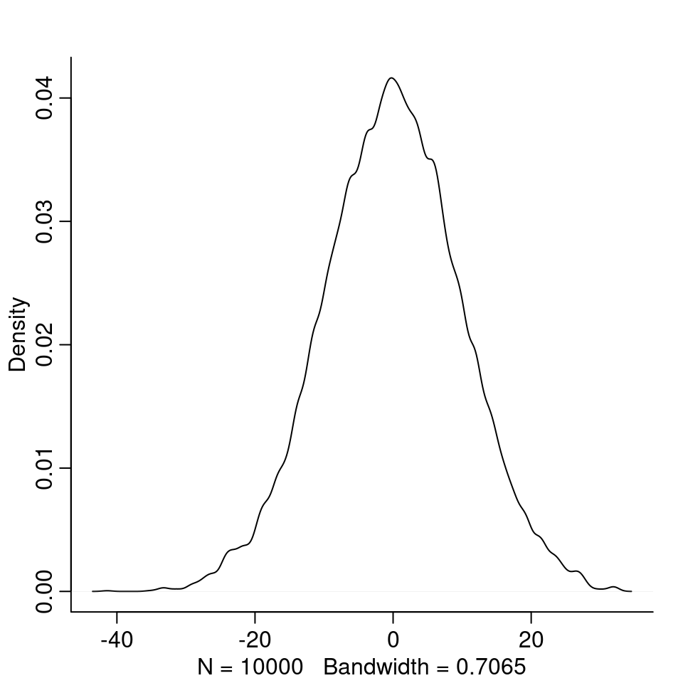
4M2. Translate the model just above into a quap() formula.
flist <- alist(
            y ~ dnorm(mu, sigma),
            mu ~ dnorm(0, 10),
            sigma ~ dexp(1)
          )
4M3. Translate the quap() formula below into a mathematical model definition.
flist <- alist(
  y ~ dnorm( mu, sigma ),
  mu <- a + b*x,
  a ~ dnorm( 0, 10 ),
  b ~ dnorm( 0, 1 ),
  sigma ~ dexp( 1 )
)
The mathematical definition: \[\begin{align*} y_i &\sim \text{Normal}(\mu_i, \sigma) \\ \mu_i &= \alpha + \beta x_i \\ \alpha &\sim \text{Normal}(0,10) \\ \beta &\sim \text{Normal}(0,1) \\ \sigma &\sim \text{Exponential}(1) \end{align*}\]
4M4. A sample of students is measured for height each year for three years. You want to fit a linear regression, using year as a prediction. Write down the mathematical model definition. \[\begin{align*} h_i &\sim \text{Normal}(\mu_i, \sigma) \\ \mu_i &= \alpha + \beta t_i \\ \alpha &\sim \text{Normal}(120, 20) \\ \beta &\sim \text{Normal}(0, 10) \\ \sigma &\sim \text{Uniform}(0, 50) \end{align*}\] Here, \(h_i\) is the height and \(t_i\) is the year of the \(i\)th observation. Since \(\alpha\) is the average height of a student at year zero, I picked a normal distribution with mean 120 (assuming an average height of 120cm) and standard deviation 20. For \(\beta\), I picked a normal distribution with mean 0 and standard deviation 10, meaning on average, a person grows 0cm per year with standard deviation 10cm, since I don’t expect many people to grow or shrink more than 20cm per year. For \(\sigma\), I picked a uniform distribution over the interval \([0, 50]\), expecting that the variance among heights for students of the same age is not larger than 50cm.
We can also do a small prior predictive check:
N <- 1000
a <- rnorm( N, 120, 20 )
b <- rnorm( N, 0, 10 )
sigma <- runif( N, 0, 50 )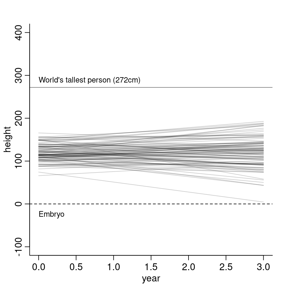
The model mostly stays between 0cm and 250cm. It still goes quite extreme and also has negative growth but otherwise it doesn’t look to unreasonable.
A short look at the predicted distribution of height at the first year:
height_0 <- rnorm( N, a + b * 0, sigma )
dens( height_0 )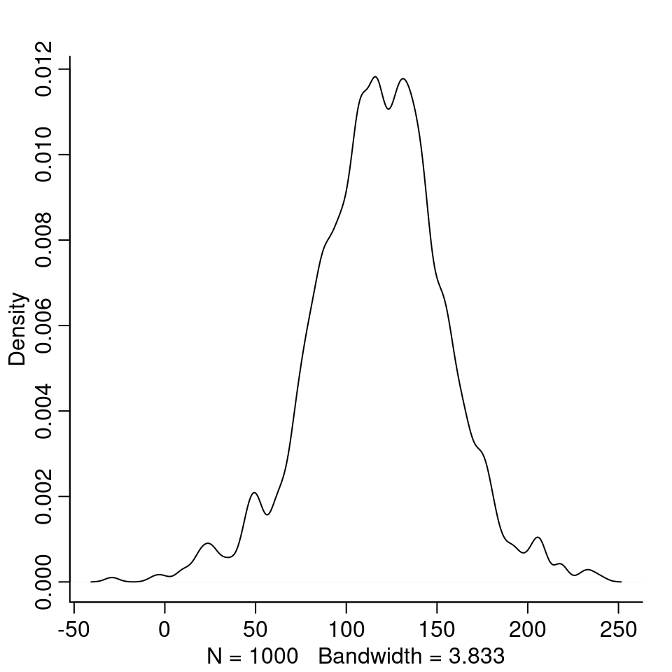
Most students at first year would be expected to be between 50cm and 200cm tall.
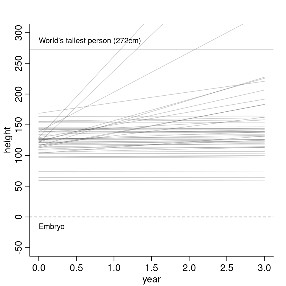
4M5. Now suppose, I remind you that every student got taller each year. I will change my priors as follows: \[\begin{align*} \alpha &\sim \text{Normal}(120, 20) \\ \beta &\sim \text{Log-Normal}(0, 2.5) \end{align*}\] I changed \(\beta\) to a log-normal distribution, so that \(\beta\), the indicator for growth per year, is greater or equal than zero. The resulting model lines then look as follows:
4M6. Now suppose, the variance among heights for students of the same age is never more than 64cm. I thus change my priors as follows: \[\sigma \sim \text{Uniform}(0, 64).\]
4M7. Refit model m4.3 from the chapter but omit the mean weight xbar. Compare the new model’s posterior to that of the original model. In particular, look at the covariance among the parameters. What is different?
First, let’s load the data and fit the m4.3 model again:
data("Howell1")
d <- Howell1
d2 <- d[ d$age >= 18, ]
xbar <- mean( d2$weight )
m4.3 <- quap(
        alist(
          height ~ dnorm( mu, sigma),
          mu <- a + b * ( weight - xbar ) ,
          a ~ dnorm( 178, 20),
          b ~ dlnorm( 0, 1),
          sigma ~ dunif(0, 50)
        ) ,
        data = d2
)
precis(m4.3)| mean | sd | 5.5% | 94.5% | |
|---|---|---|---|---|
| a | 154.601 | 0.270 | 154.169 | 155.03 |
| b | 0.903 | 0.042 | 0.836 | 0.97 |
| sigma | 5.072 | 0.191 | 4.766 | 5.38 |
Now, we refit an uncentered version of the model:
m4.3_u <- quap(
        alist(
          height ~ dnorm( mu, sigma),
          mu <- a + b * weight ,
          a ~ dnorm( 178, 20),
          b ~ dlnorm( 0, 1),
          sigma ~ dunif(0, 50)
        ) ,
        data = d2
)
precis(m4.3_u)| mean | sd | 5.5% | 94.5% | |
|---|---|---|---|---|
| a | 114.534 | 1.898 | 111.501 | 117.567 |
| b | 0.891 | 0.042 | 0.824 | 0.957 |
| sigma | 5.073 | 0.191 | 4.767 | 5.378 |
The estimates for \(\beta\) and \(\sigma\) are still the same, only \(\alpha\) is changed. This makes sense since now in the uncentered version, the meaning of \(\alpha\) has changed. Before \(\alpha\) was the average height for when $ x -{x}$ was 0, that is for observations where the weight is equal to the average weight. Now, \(\alpha\) is the average height for the case that the weight is 0. As there are no people with a weight of zero, this \(\alpha\) is harder to interpret. We can compute \(\mu\) in the uncentered version for when \(x\) is the average weight:
113.9 + 0.9 * xbar[1] 154and unsurprisingly, we get the same value as in the centered model. The results for the two models are thus pretty much equal. Let’s check the covariance between parameters. Remember, in the centered version, the correlation between parameters was practically zero.
( vcm <- vcov( m4.3_u ) )| a | b | sigma | |
|---|---|---|---|
| a | 3.60 | -0.08 | 0.01 |
| b | -0.08 | 0.00 | 0.00 |
| sigma | 0.01 | 0.00 | 0.04 |
We now observe some correlation between \(\alpha\) and \(\beta\). Let’s check the correlation matrix:
cov2cor( vcm )| a | b | sigma | |
|---|---|---|---|
| a | 1.00 | -0.99 | 0.03 |
| b | -0.99 | 1.00 | -0.03 |
| sigma | 0.03 | -0.03 | 1.00 |
Now, there’s a quite strong negative correlation between the two parameters.
The same in visual:
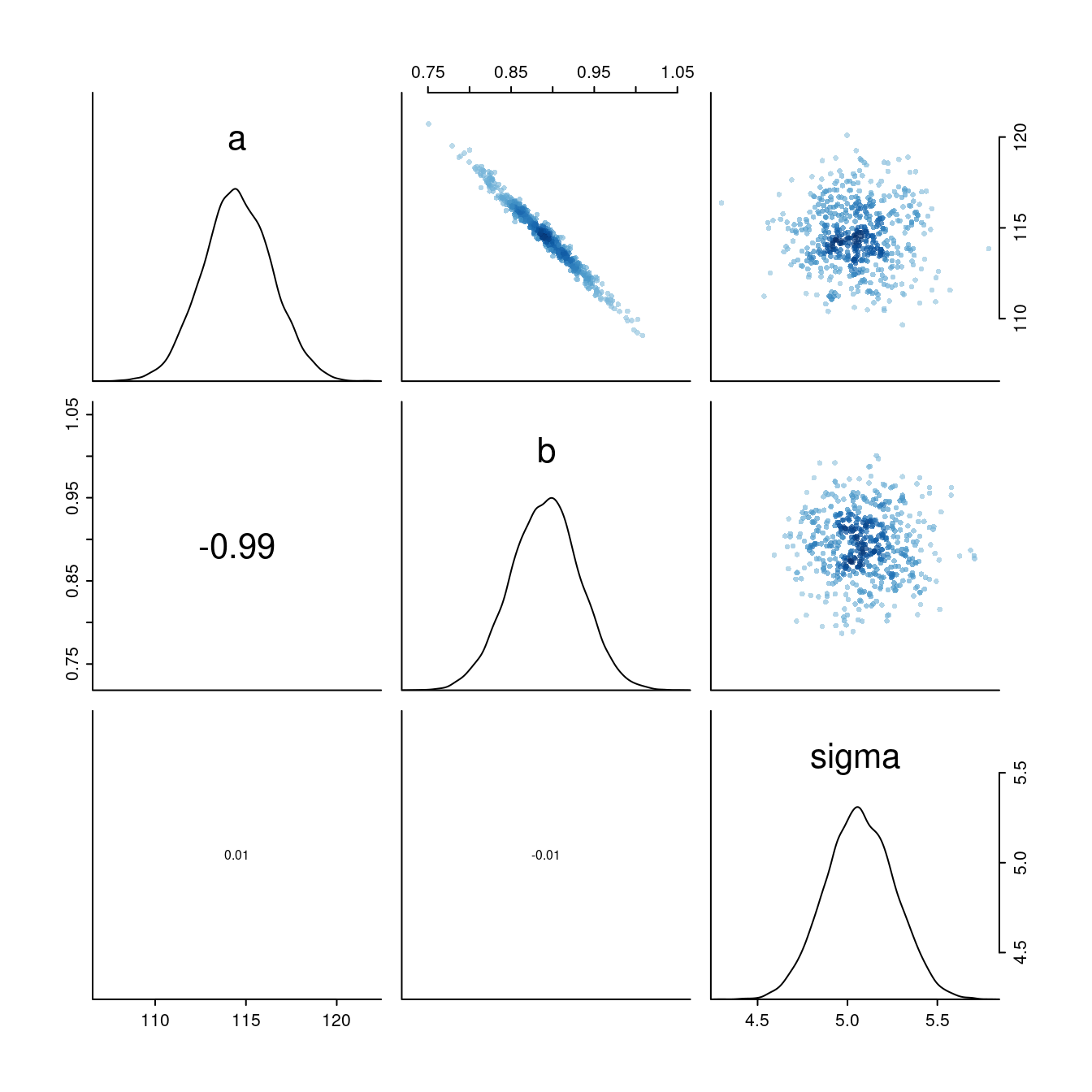
What is happening here? Every time the slope parameter increases a bit, the intercept changes in the opposite direction, i.e. decreases.
Compare the posterior predictions of both models:
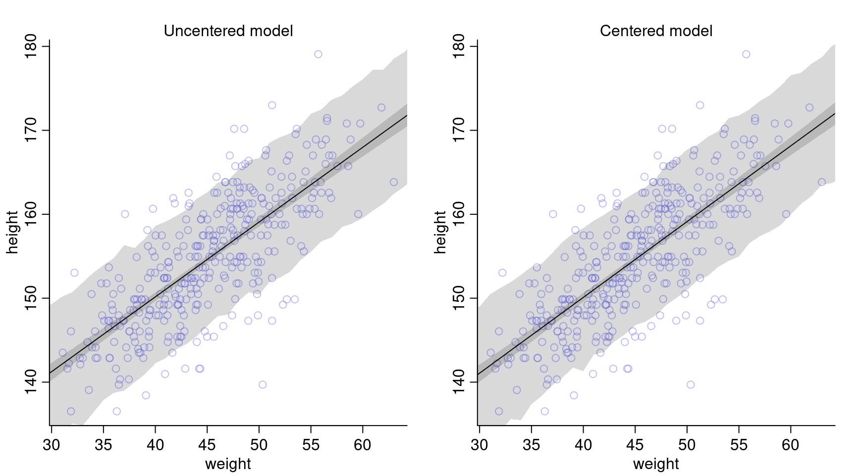
The posterior predictions look very much the same for both models.
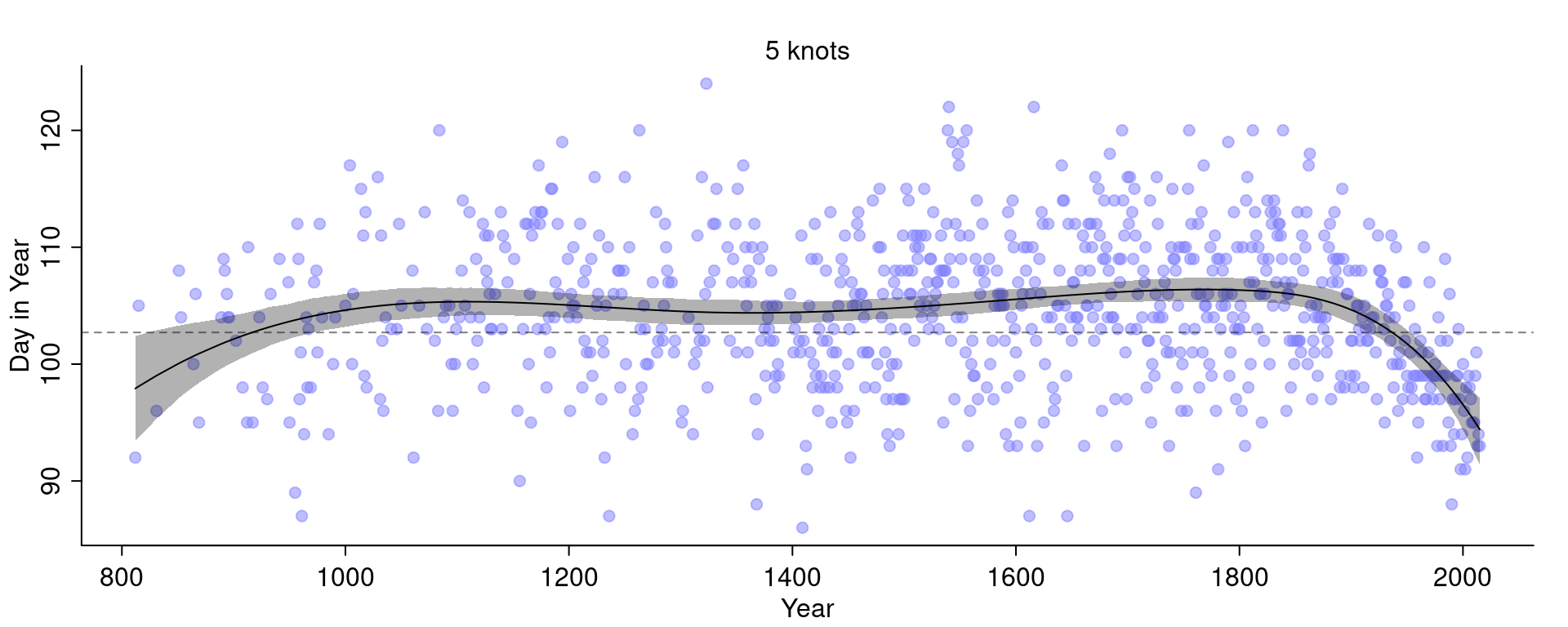
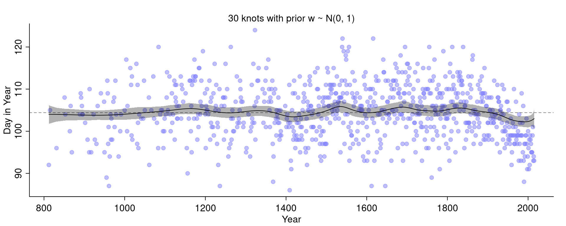
4M8. In the chapter, we used 15 knots with the cherry blossom spline. Increase the number of knots and observe what happens to the resulting spline.
First, let’s load the data:
data("cherry_blossoms")
d <- cherry_blossoms
d2 <- d[ complete.cases(d$doy) , ]
Just to be sure to see an effect, I’m going to double the number of knots to 30:
library(splines)
num_knots <- 30
knot_list <- quantile( d2$year, probs = seq(0, 1, length.out = num_knots ) )

B <- bs(d2$year,
        knots=knot_list[-c(1, num_knots)],
        degree=3, intercept=TRUE)

ms <- quap(
  alist(
    D ~ dnorm( mu, sigma ),
    mu <- a + B %*% w,
    a ~ dnorm( 100, 10 ),
    w ~ dnorm( 0, 10 ),
    sigma ~ dexp(1)
  ), data=list(D=d2$doy, B=B) ,
  start = list( w=rep( 0, ncol(B)))
)
Compare this with the fit we had before with 15 knots:

The curve with 30 knots is less smooth and even wigglier than the curve with 15 knots.
Let’s now also change the width of the prior on the weights. I am going to change the standard deviation for the prior on the weights \(w\) to 100 (before it was 10).
ms <- quap(
  alist(
    D ~ dnorm( mu, sigma ),
    mu <- a + B %*% w,
    a ~ dnorm( 100, 10 ),
    w ~ dnorm( 0, 100 ),
    sigma ~ dexp(1)
  ), data=list(D=d2$doy, B=B) ,
  start = list( w=rep( 0, ncol(B)))
)
Let’s see what happens:
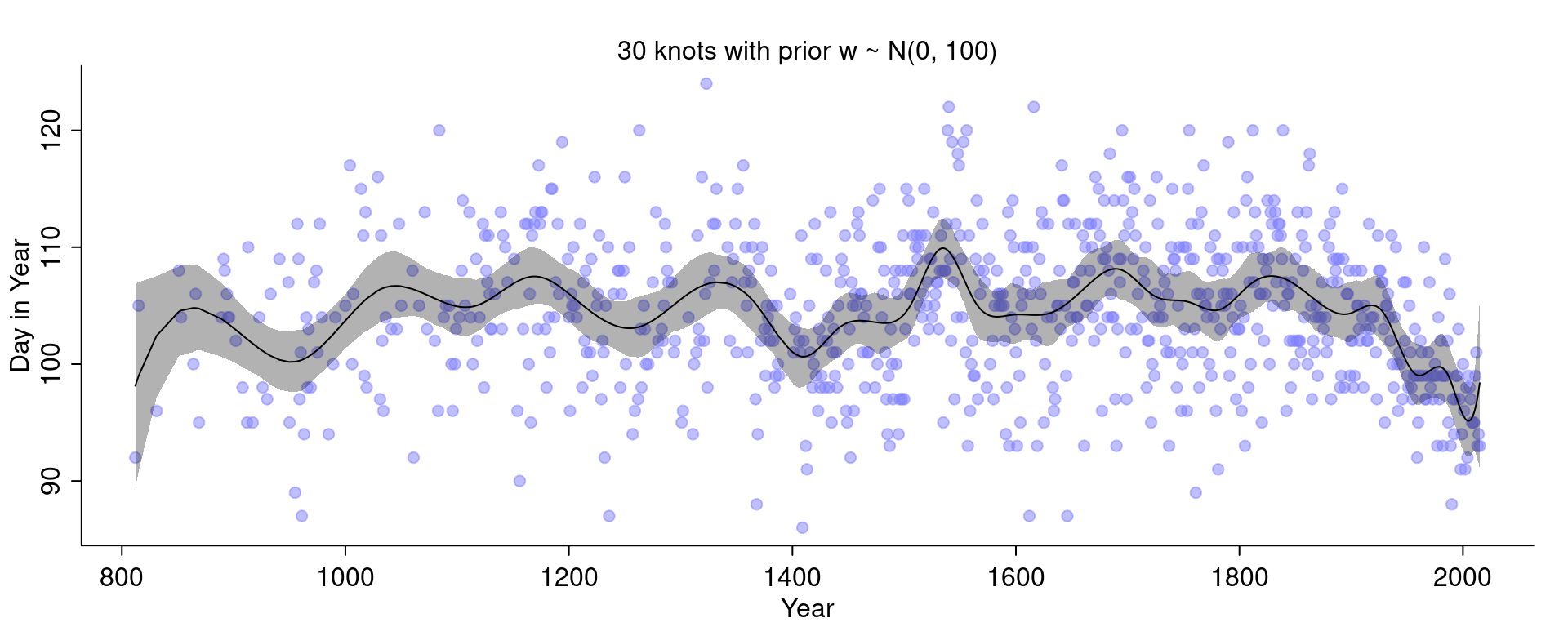
It got even wigglier! This is a bit difficult to see because the curve with 15 knots and the narrower priors was quite wiggly but it can for example be seen at the end to the right.
More knots means there are more basis functions and so the curve can fit smaller local details. Fitting only a handful of knots will force the model to fit the more global trends:
If we turn up the standard deviation of the prior we allow the weights to become larger. If the standard deviation is small, the weights will be closer to 0 and thus wiggle around closer to the mean line. If the weights become larger, we allow the curve to have more peaks.
Check what happens if we make the prior on \(w\) extremely narrow:
Hard.
The first hard questions use the !Kung data again, so we need to reload them:
d <- Howell14H1. !Kung census data: Provide predicted heights and 89% intervals for the following weights of individuals.
weights <- c(46.95, 43.72, 64.78, 32.59, 54.63)For this, I reuse the model m4.3 from above and simulate heights for the individuals above by hand:
post <- extract.samples(m4.3)
sim.height <- sapply( weights, function(weight) {
  rnorm(
    n = nrow(post),
    mean = post$a + post$b * ( weight - xbar ),
    sd = post$sigma
  )
})PI() gives us:
| individual | weight | expected_height | PI_89_lower | PI_89_upper |
|---|---|---|---|---|
| 1 | 47.0 | 156 | 148 | 165 |
| 2 | 43.7 | 153 | 145 | 162 |
| 3 | 64.8 | 172 | 164 | 181 |
| 4 | 32.6 | 143 | 135 | 152 |
| 5 | 54.6 | 163 | 155 | 171 |
4H2. Select the rows from the Howell1 data with age below 18 years.
- Fit a linear regression to these data, using
quap().
I will use the same model as above but adapt the prior for \(\alpha\) to account for lower heights:
d18 <- d[ d$age < 18, ]
xbar <- mean( d18$weight )

model18 <- quap(
  alist(
    height ~ dnorm( mu, sigma) ,
    mu <- a + b * ( weight - xbar )  ,
    a ~ dnorm( 156, 20) ,
    b ~ dlnorm( 0, 1 ) ,
    sigma ~ dunif(0, 50)
  ),
  data=d18
)
precis(model18)| mean | sd | 5.5% | 94.5% | |
|---|---|---|---|---|
| a | 108.36 | 0.609 | 107.39 | 109.34 |
| b | 2.72 | 0.068 | 2.61 | 2.83 |
| sigma | 8.44 | 0.431 | 7.75 | 9.12 |
As above, since the weight values are centered, the intercept a corresponds to the average height, which is here 108.3. This is much lower than in the model above (but expected since the individuals in this data set are younger). The slope b is interpreted such that for every 10kg heavier, an individual is expected to be 27cm taller. The standard deviation sigma in this model is higher than in the one above, suggesting a higher uncertainty in the predictions.
- Plot the raw data and superimpose the MAP regression line and 89% interval for the mean and for the predicted height.
We first compute the regression line by generating a sequence over the whole range of weights for which we then sample from the posterior distribution to compute a sample of mu, of which we can then compute the mean and the 89% PI. We similarly compute the 89% PI for the predicted height.
weight.seq <- seq(from=4, to=45, length.out = 30)
post <- extract.samples(model18)

mu <- link( model18, data = list(weight = weight.seq))
mu.mean <- apply(mu, 2, mean)
mu.PI <- apply(mu, 2, PI, prob=0.89)

sim.height <- sim( model18, data = list(weight = weight.seq ))
height.PI <- apply(sim.height, 2, PI, prob=0.89)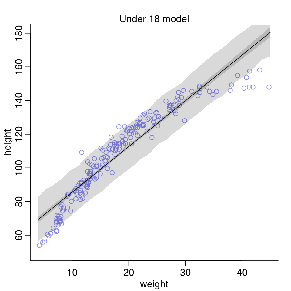
- What aspects of the model fit concern you?
The linear model doesn’t seem to be a very good fit for the data. It performs very poorly for the lower and higher values of weight. One possibility to improve the model could be to use a polynomial model (e.g. of 2nd order) instead.
4H3. A colleague exclaims: “Only the logarithm of body weight scales with height!” Let’s try this out.
- Use the entire
Howell1data frame using the following model: \[\begin{align*} h_i &\sim \text{Normal}(\mu_i, \sigma) \\ \mu_i &= \alpha + \beta (\log(w_i) - \bar{x}_l) \\ \alpha &\sim \text{Normal}(178, 20) \\ \beta &\sim \text{Log-Normal}(0, 1) \\ \sigma &\sim \text{Uniform}(0, 50) \end{align*}\] The value \(\bar{x}_l\) is the mean of the log-weights. Here the model description in R:
d <- Howell1
xbarl <- mean( log( d$weight ) )

model.l <- quap(
  alist(
    height ~ dnorm( mu, sigma) ,
    mu <- a + b*( log( weight ) - xbarl ),
    a ~ dnorm( 178, 20) ,
    b ~ dlnorm( 0, 1) ,
    sigma ~ dunif(0, 50)
  ),
  data=d
)
precis(model.l)| mean | sd | 5.5% | 94.5% | |
|---|---|---|---|---|
| a | 138.27 | 0.220 | 137.92 | 138.62 |
| b | 47.08 | 0.383 | 46.46 | 47.69 |
| sigma | 5.13 | 0.156 | 4.89 | 5.38 |
Interpreting these results is a bit more difficult since we transformed the weights using the logarithm. The intercept a corresponds to the average height of someone whose log-weight is equal to the mean of log-weights, i.e. whose weight is 31kg (this is equivalent to the geometric mean).
How to interpret the b value?
If we increase the weight by \(p\) percent (ignoring the centralization term for now), we get the following expression for \(\mu\):
\[\begin{align*}
\mu &= \alpha + \beta \log(\text{weight} \times (1 + p) )
\end{align*}\]
Using some rules for logarithms, we get:
\[\begin{align*}
\mu &= \alpha + \beta \log(\text{weight}) + \beta \log(1 + p)
\end{align*}\]
That is, an increase of \(p\) percent in the weight variable is associated with an increase of \(\mu\) of \(\beta \log(1 + p)\).
I personally find this not super intuitive, so let’s have a look at some plots as well. We compute again the mean \(\mu\) and its compatibility interval as well as simulate predictions for the height.
weight.seq <- seq(from=2, to=70, length.out = 100)
post <- extract.samples(model.l)
# compute mu
mu <- link( model.l, data = list(weight = weight.seq))
mu.mean <- apply(mu, 2, mean)  # MAP line
mu.PI <- apply(mu, 2, PI, prob=0.89)

# compute predicted height
sim.height <- sim( model.l, data = list(weight = weight.seq))
height.PI <- apply(sim.height, 2, PI, prob=0.89)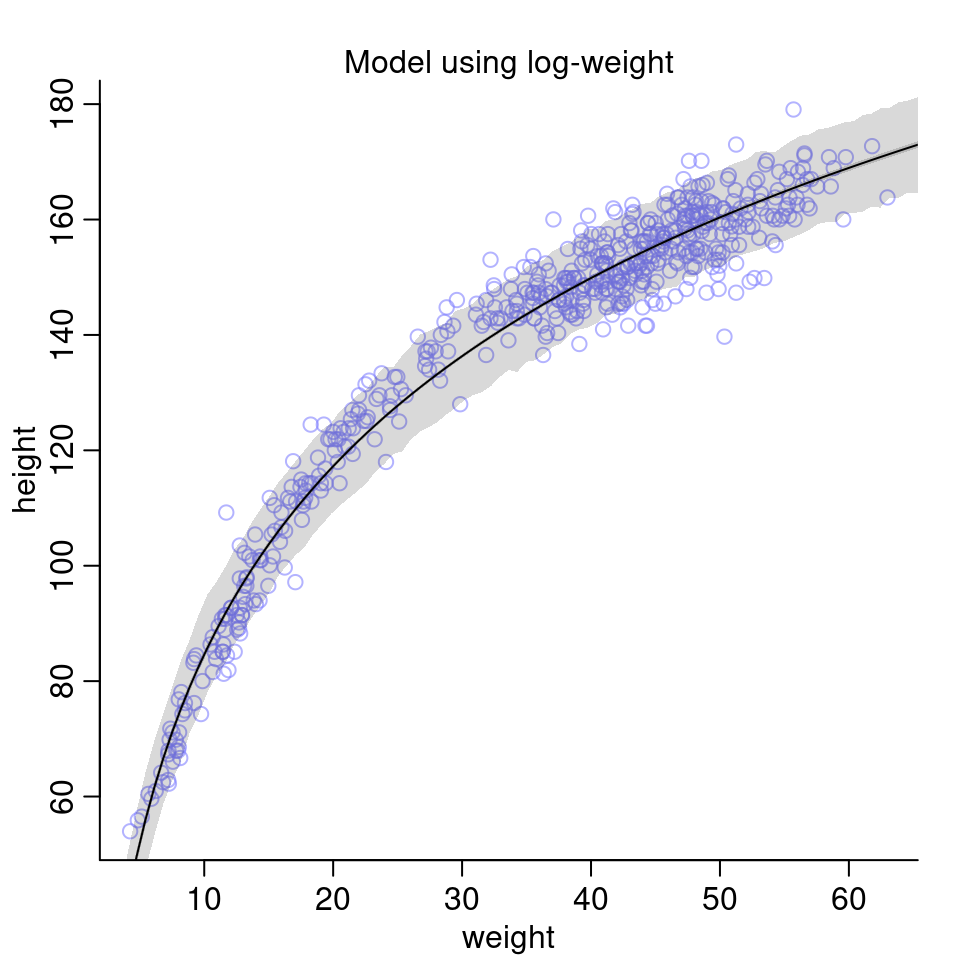
Compared to the model above fit to only the children and also compared to the models earlier in the chapter using the full data set with polynomial regression, this model seems to perform quite well on the data.
We can also visualize the model on log scale:
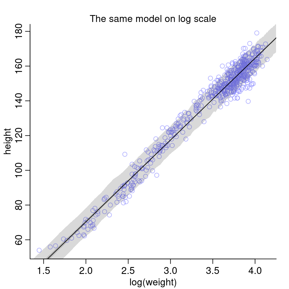
Given the last two plots, I’d say the colleague was right: The logarithm of body weight scales very well with height.
4H4. Plot the prior predictive distribution for the parabolic polynomial regression model in the chapter.
For the prior predictive check, we don’t actually need to run the model code again. Just remember that we’re fitting the following model: \[\begin{align*} h_i &\sim \text{Normal}(\mu_i, \sigma) \\ \mu_i &= \alpha + \beta_1 x_i + \beta_2 x_i^2 \\ \alpha &\sim \text{Normal}(178, 20) \\ \beta_1 &\sim \text{Log-Normal}(0,1) \\ \beta_2 &\sim \text{Normal}(0,1) \\ \sigma &\sim \text{Uniform}(0, 50) \end{align*}\]
It suffices to generate samples from our priors and then plot the resulting curves:
N <- 1000
a <- rnorm( N, 178, 20 )
b1 <- rlnorm( N, 0, 1 )
b2 <- rnorm(N, 0, 1)
sigma <- runif( N, 0, 50 )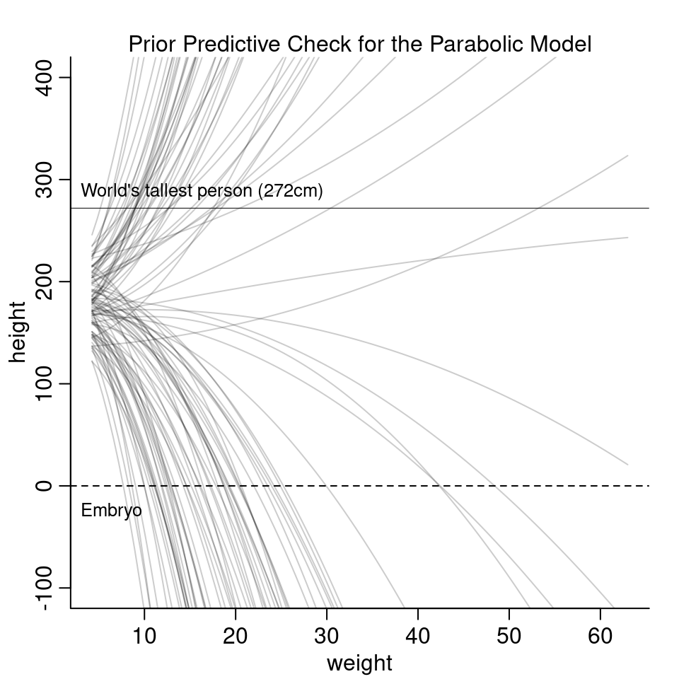
The curves are all over the place and it is hard to see much from it. The next part of the question asks to modify the priors in a way so that the prior predictions stay within the biologically reasonable space.
Let’s recap some high school math.
In the equation \(f(x) = b_2x^2\), the larger \(b_2\) is, the narrower will be the parabola:
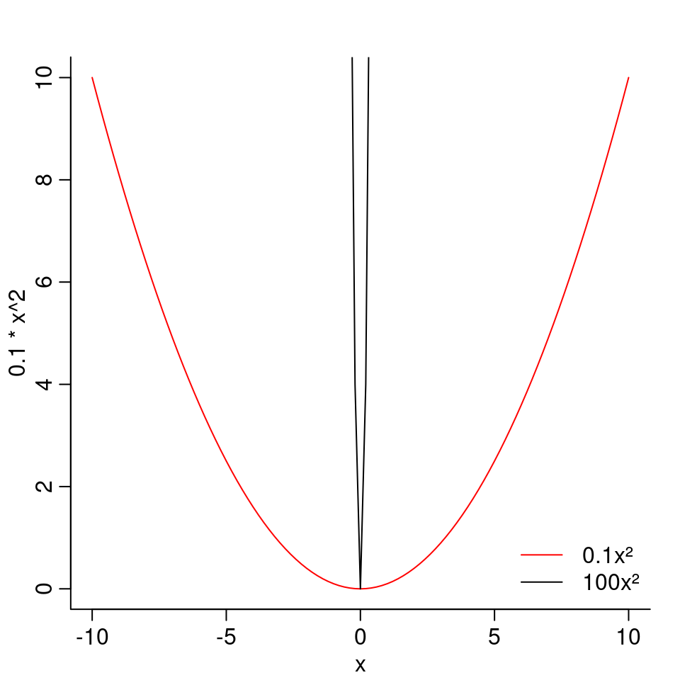 As a negative \(b_2\) would mean a downwards curve, we want \(b_2\) to be positive.
To keep \(b_2\) positive, we can use the Log-Normal again. However, the standard deviation of the Log-Normal is a bit difficult to tune. A small standard deviation means the function is less skewed (has less values that are very high) but then it also has fewer values that are very small. Whereas a high standard deviation means there are many very small values but also a few very very big values. Overall, a distribution that is a bit hard to tune.
I instead will use an Exponential with a high value for \(\lambda\). In that case, most values will be small.
As a negative \(b_2\) would mean a downwards curve, we want \(b_2\) to be positive.
To keep \(b_2\) positive, we can use the Log-Normal again. However, the standard deviation of the Log-Normal is a bit difficult to tune. A small standard deviation means the function is less skewed (has less values that are very high) but then it also has fewer values that are very small. Whereas a high standard deviation means there are many very small values but also a few very very big values. Overall, a distribution that is a bit hard to tune.
I instead will use an Exponential with a high value for \(\lambda\). In that case, most values will be small.
N <- 1000
a <- rnorm( N, 178, 20 )
b1 <- rlnorm( N, 0, 1 )
b2 <- rexp(N, 20)
sigma <- runif( N, 0, 50 )
With these priors, the prior predictions look as follow:
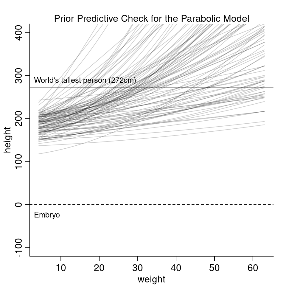
The new priors look more reasonable based on these curves. However, they are much more restrictive and it is hard to argue if the line should curve upwards or downwards. In the model fit in the chapter, the estimated parameter for \(b_2\) is actually negative and curves downwards for high values of weight. To summarize, getting the priors right and interpreting the parameters for a polynomial regression is really difficult.
4H5. Return to data(cherry_blossoms) and model the association between blossom date (doy) and March temperature.
You may consider a linear model, a polynomial, or a spline on temperature.
How well does temperature trend predict the blossom trend?
First, let’s plot the two variables.
d <- cherry_blossoms
plot( doy ~ temp, d, col=col.alpha(rangi2, 0.5), pch=20, cex=1.4,
      ylab = "Day of Year", xlab="Temperature [°C]")
mtext("Temperature vs Day of Blossom")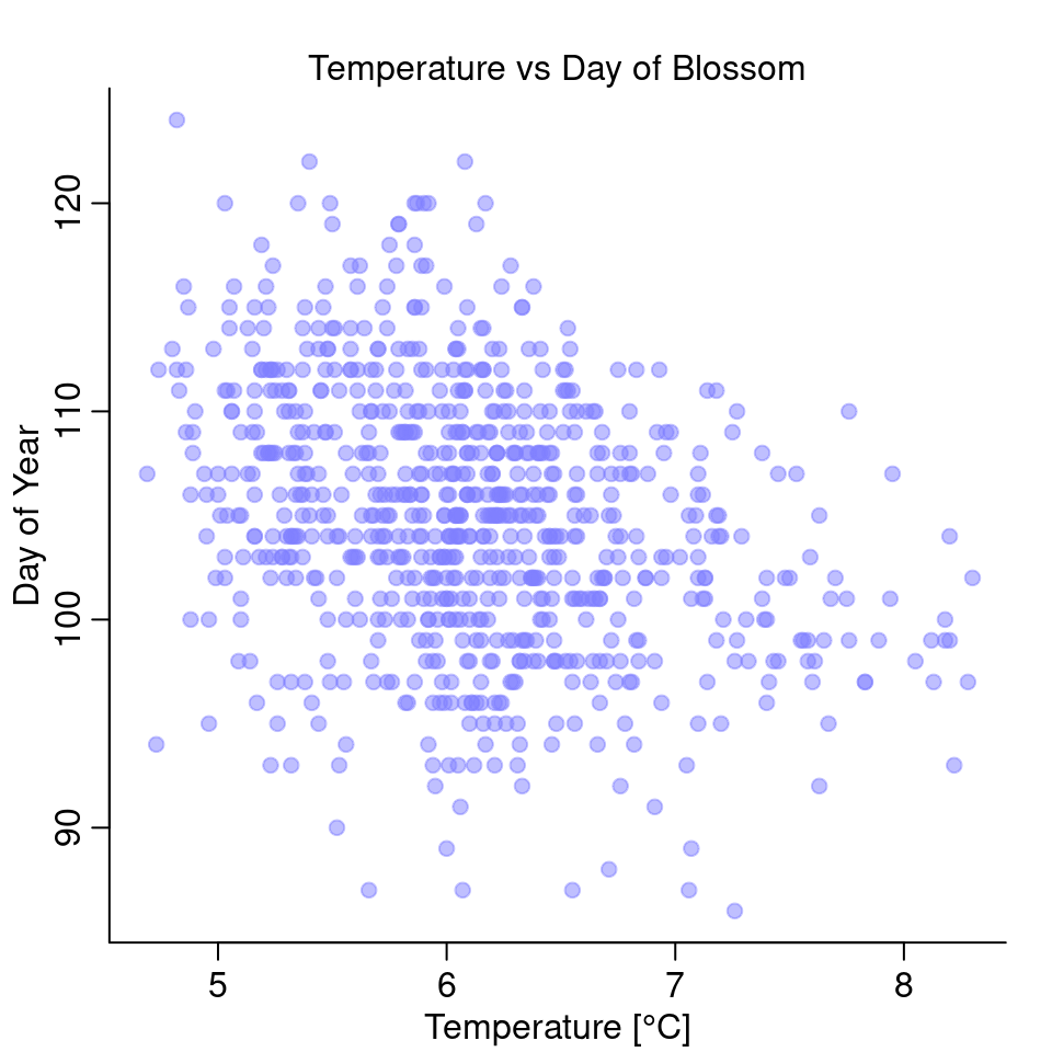
It looks like there is a negative relationship between the two: the higher the temperature, the earlier in the year does it start to blossom.
Since there are many missing values, I’ll restrict the data to cases where both doy and temp exist.
d2 <- d[complete.cases(d[, c("doy", "temp")]), ] %>%
  arrange(temp)
Linear Model
First, I’ll try a linear model:
set.seed(2020)
mean_temp <- mean(d2$temp)
ml <- quap(
  alist(
    D ~ dnorm( mu, sigma ),
    mu <- a + b*(temp - mean_temp),
    a ~ dnorm( 100, 10 ),
    b ~ dnorm( 0, 1 ),
    sigma ~ dexp(1)
  ), data=list(D=d2$doy, temp=d2$temp)
)
precis(ml)| mean | sd | 5.5% | 94.5% | |
|---|---|---|---|---|
| a | 104.92 | 0.210 | 104.58 | 105.25 |
| b | -2.74 | 0.294 | -3.21 | -2.27 |
| sigma | 5.89 | 0.148 | 5.65 | 6.13 |
Indeed, the model estimates a negative slope \(\beta\).
Let’s plot the model:
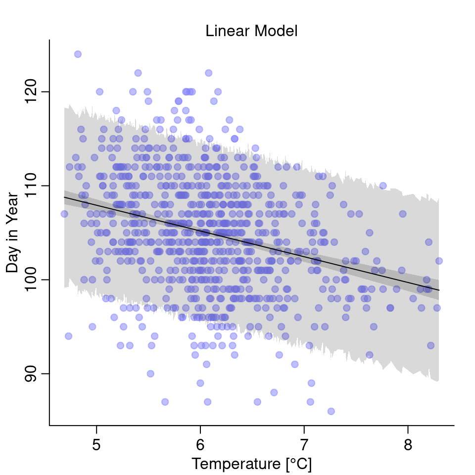
The temperature does have some effect on the day of first blossom but note that the uncertainty is quite high.
Polynomial Model
I will try both a quadratic and a cubic model.
d2$temp_s <- (d2$temp - mean_temp) / sd(d2$temp)
d2$temp_s2 <- d2$temp_s^2
d2$temp_s3 <- d2$temp_s^3
The quadratic model:
mquadratic <- quap(
  alist(
    D ~ dnorm( mu, sigma ),
    mu <- a + b1*temp_s + b2*temp_s2,
    a ~ dnorm( 100, 10 ),
    b1 ~ dnorm( 0, 1 ),
    b2  ~ dnorm(0, 1),
    sigma ~ dexp(1)
  ), data=list(D=d2$doy, temp_s=d2$temp_s, temp_s2 = d2$temp_s2)
)
And the cubic model:
mcubic <- quap(
  alist(
    D ~ dnorm( mu, sigma ),
    mu <- a + b1*temp_s + b2*temp_s2 + b3*temp_s3,
    a ~ dnorm( 100, 10 ),
    b1 ~ dnorm( 0, 1 ),
    b2 ~ dnorm( 0, 1 ),
    b3 ~ dnorm( 0, 1 ),
    sigma ~ dexp(1)
  ), data=list(D=d2$doy, temp_s=d2$temp_s, temp_s2 = d2$temp_s2,
               temp_s3 = d2$temp_s3)
)
And this is what the models look like:
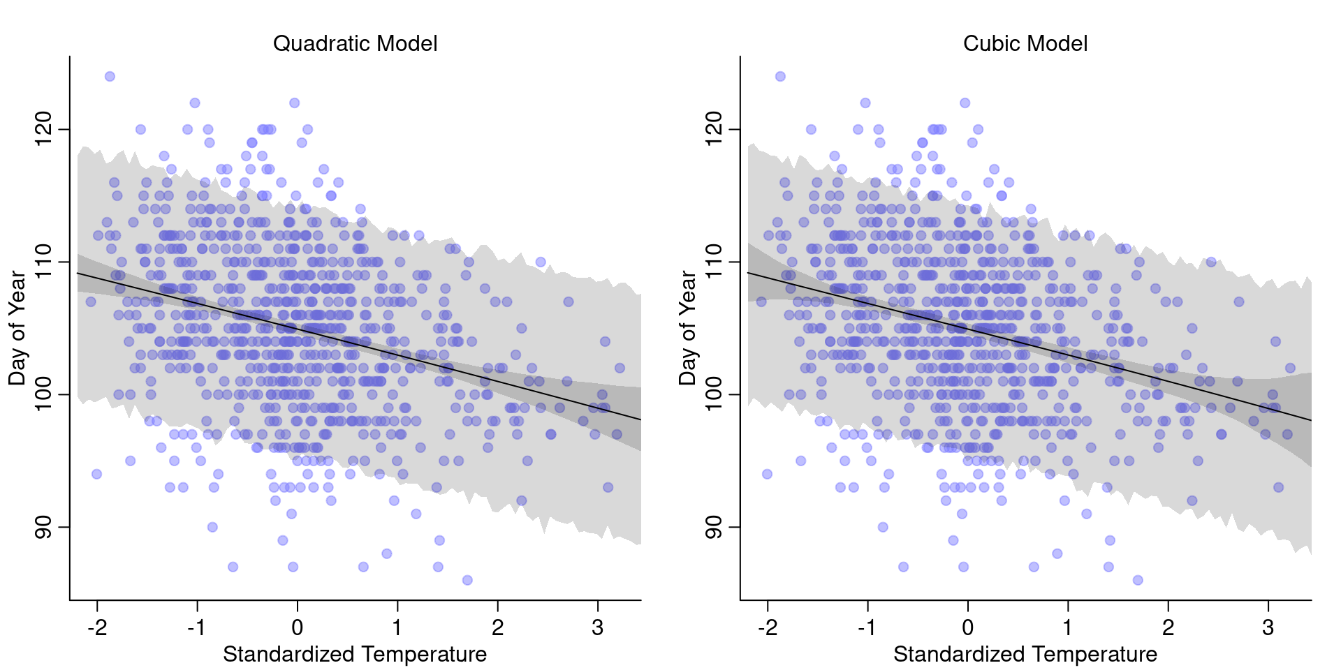
Interestingly, the two models look pretty much the same as the linear model. So we don’t gain anything from using a polynomial model, instead we only loose interpretability:
precis(mcubic)| mean | sd | 5.5% | 94.5% | |
|---|---|---|---|---|
| a | 104.930 | 0.268 | 104.503 | 105.358 |
| b1 | -1.950 | 0.341 | -2.495 | -1.404 |
| b2 | -0.010 | 0.203 | -0.335 | 0.314 |
| b3 | -0.001 | 0.105 | -0.169 | 0.167 |
| sigma | 5.889 | 0.148 | 5.653 | 6.125 |
While the quadratic and cubic terms have very small parameters, almost close to 0, they still make the interpretation less forward. So in this case, nothing gained from polynomial regression.
Splines
Lastly, let’s also check out how splines perform for this example. I will use 15 knots and the same priors as also used in the chapter on the weight.
num_knots <- 15
knot_list <- quantile( d2$temp, probs = seq(0, 1, length.out = num_knots ) )

B <- bs(d2$temp,
        knots=knot_list[-c(1, num_knots)],
        degree=3, intercept=TRUE)

ms <- quap(
  alist(
    D ~ dnorm( mu, sigma ),
    mu <- a + B %*% w,
    a ~ dnorm( 100, 10 ),
    w ~ dnorm( 0, 10 ),
    sigma ~ dexp(1)
  ), data=list(D=d2$doy, B=B) ,
  start = list( w=rep( 0, ncol(B)))
)
And that’s what the model looks like:
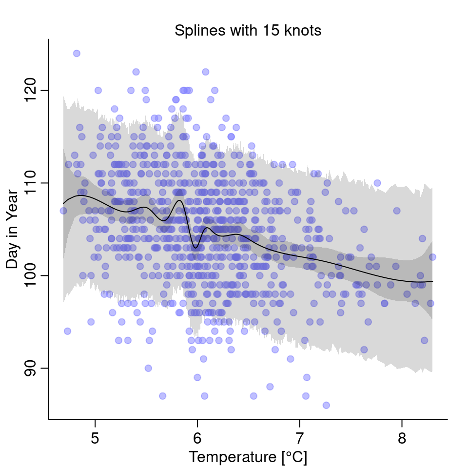
The splines are wigglier and have one especially weird dip just for temperatures below 6°C. Personally, I am skeptical this dip makes physically sense and it isn’t just an artifact of the splines being too wiggly. Comparing the three models, in this case, I’d go with the simple linear model.
4H6. Simulate the prior predictive distribution for the cherry blossom spline in the chapter. Adjust the prior on the weights and observe what happens. What do you think the prior on the weight is doing?
I will only draw 10 different samples for each weight so that the plot won’t get too cluttered.
num_knots <- 15
knot_list <- quantile( d2$year, probs = seq(0, 1, length.out = num_knots ) )
years <- seq(from=min(d2$year), to=max(d2$year), length.out = 100)

B <- bs(years,
        knots=knot_list[-c(1, num_knots)],
        degree=3, intercept=TRUE)

N <- 10
w <- rnorm(N*ncol(B), 0, 10 )
w <- matrix(w, nrow=ncol(B))
In the top, we have again the basis functions and in the bottom we see the basis functions multiplied with weight values samples from our prior:
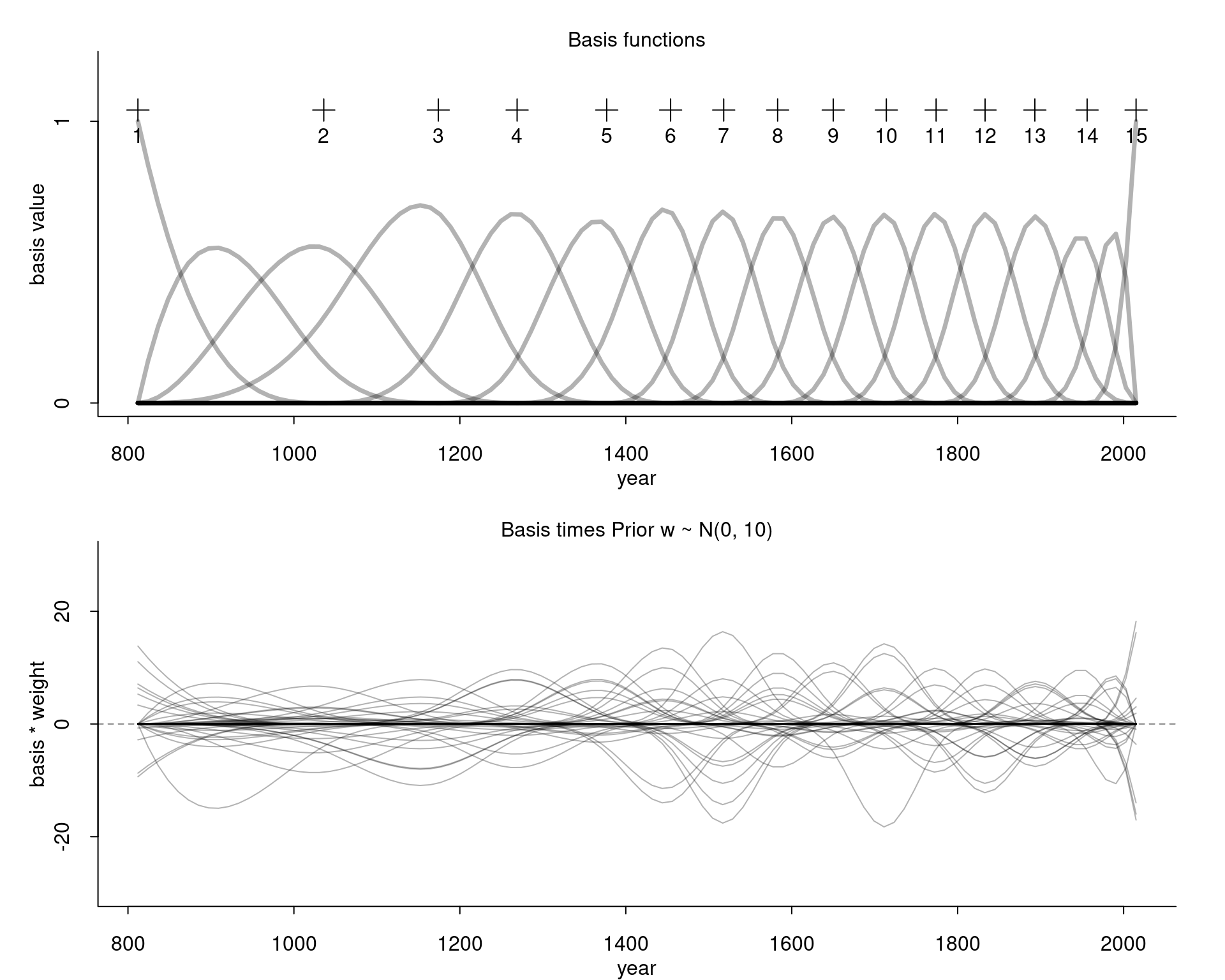
Compare this for example with the curves we get for our wider prior:
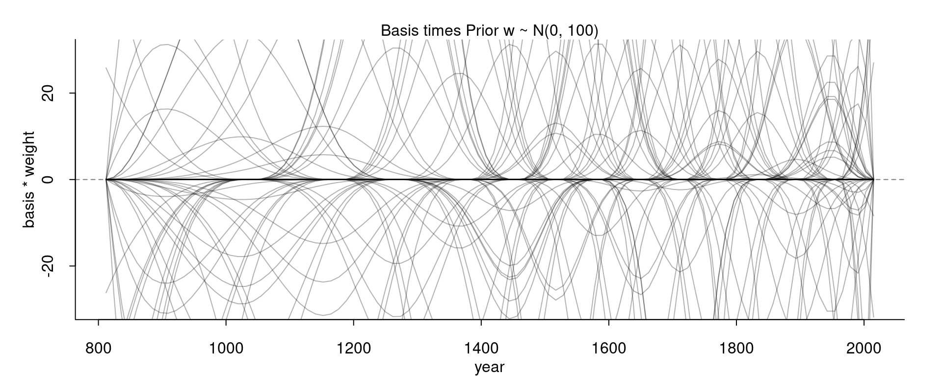
With this wider prior, the curve go much higher and lower. With the standard deviation of the prior we can thus control how high or low the curve can wiggle away from the mean.
4H7. The cherry blossom spline in the chapter used an intercept \(\alpha\), but technically it doesn’t require one. The first basis functions could substitute for the intercept. Try refitting the cherry blossom spline without the intercept.
Let’s see what happens if we just omit the intercept:
num_knots <- 15
knot_list <- quantile( d2$year, probs = seq(0, 1, length.out = num_knots ) )

B <- bs(d2$year,
        knots=knot_list[-c(1, num_knots)],
        degree=3, intercept=TRUE)
set.seed(20)
m <- quap(
alist(
D ~ dnorm( mu, sigma ),
mu <- B %*% w, # removed intercept
w ~ dnorm( 0, 10 ),
sigma ~ dexp(10)
), data=list(D=d2$doy, B=B) ,
start = list( w=rep( 0, ncol(B)))
)Let’s see the result:
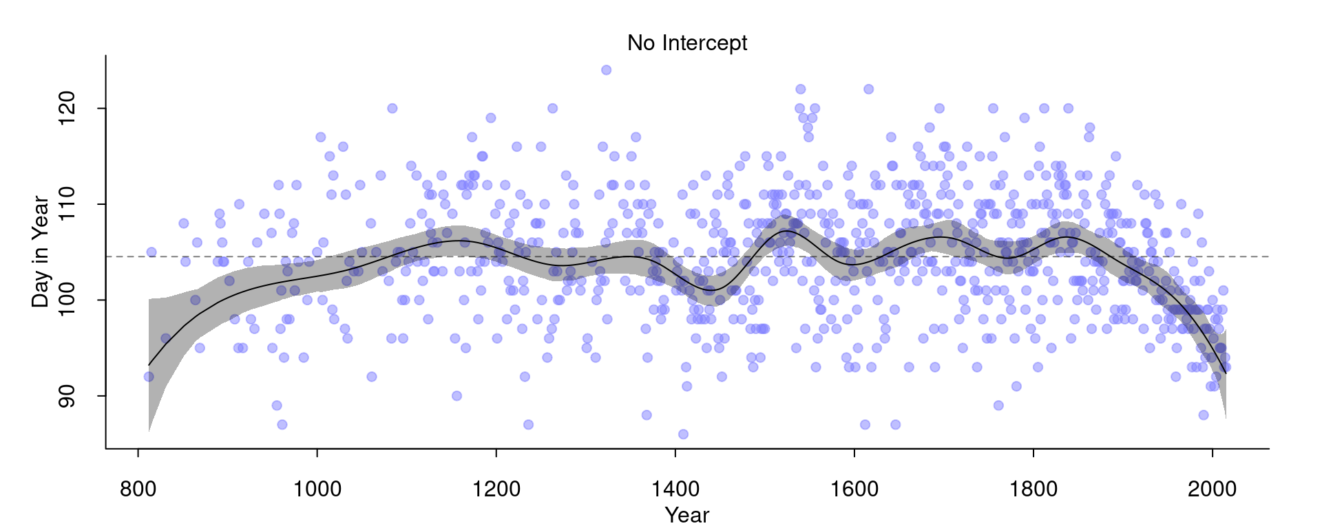
This almost worked, except that we now have that the splines seem to come from far down to the left. This is probably since we specified that the weights are distributed around 0: \(w \sim \text{Normal}(0, 10)\). Let’s fix this by changing the prior on \(w\) to this: $ w (100, 10)$. This is basically the prior we before had on the intercept.
m <- quap(
  alist(
    D ~ dnorm( mu, sigma ),
    mu <- B %*% w,    # removed intercept
    w ~ dnorm( 100, 10 ),
    sigma ~ dexp(10)
  ), data=list(D=d2$doy, B=B) ,
  start = list( w=rep( 0, ncol(B)))
)
And the result:
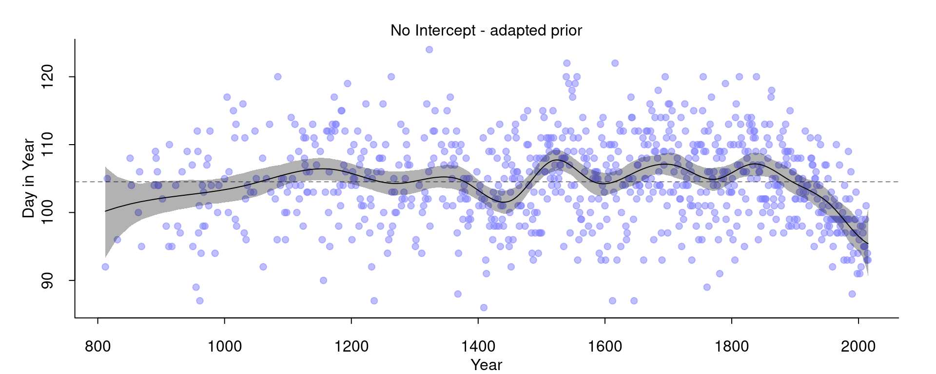
Now, we basically got the same model as before that included the intercept.