Logistic Regression
The chimpanzee data: Do chimpanzee pick the more social option?
library(rethinking)
data(chimpanzees)
d <- chimpanzees
The important variables are the variable condition, indicating if another chimpanzee sits opposite (1) the table or not (0) and the variable prosocial_left which indicates if the left lever is the more social option. These two variables will be used to predict if the chimpanzees pull the left lever or not (pulled_left).
The implied model is: \[\begin{align*} L_i &\sim \text{Binomial}(1, p_i)\\ \text{logit}(p_i) &= \alpha + (\beta_P + \beta_{PC}C_i)P_i \\ \alpha &\sim \text{Normal}(0, 10) \\ \beta_P &\sim \text{Normal}(0, 10) \\ \beta_{PC} &\sim \text{Normal}(0, 10) \end{align*}\]
We’ll write this as a map() model but will start with two simpler models with less predictors, starting with one model that has only an intercept and no predictor variables:
m10.1 <- map(
  alist(
    pulled_left ~ dbinom(1, p),
    logit(p) <- a,
    a ~ dnorm(0, 10)
  ),
  data=d
)
precis(m10.1)
mean sd 5.5% 94.5%
a 0.3201396 0.09022716 0.1759392 0.4643401This implies a MAP probability of pulling the left lever of
logistic(0.32)[1] 0.5793243with a 89% interval of
logistic( c(0.18, 0.46))[1] 0.5448789 0.6130142Next the models using the predictors:
m10.2 <- map(
  alist(
    pulled_left ~ dbinom(1, p),
    logit(p) <- a + bp*prosoc_left,
    a ~ dnorm(0, 10),
    bp ~ dnorm(0, 10)
  ),
  data=d
)
m10.3 <- map(
  alist(
    pulled_left ~ dbinom(1, p),
    logit(p) <- a + (bp + bpC*condition)*prosoc_left,
    a ~ dnorm(0, 10),
    bp ~ dnorm(0, 10),
    bpC ~ dnorm(0, 10)
  ),
  data=d
)

(cp <- compare(m10.1, m10.2, m10.3) )
WAIC SE dWAIC dSE pWAIC weight
m10.2 680.3582 9.291860 0.00000 NA 1.9295498 0.74351153
m10.3 682.6265 9.351031 2.26827 0.9406816 3.1399595 0.23918790
m10.1 687.8795 7.104503 7.52129 6.0599007 0.9696539 0.01730057The model without the interaction seems to fare better even though the third model best reflects the structure of the experiment.
plot( cp )#, 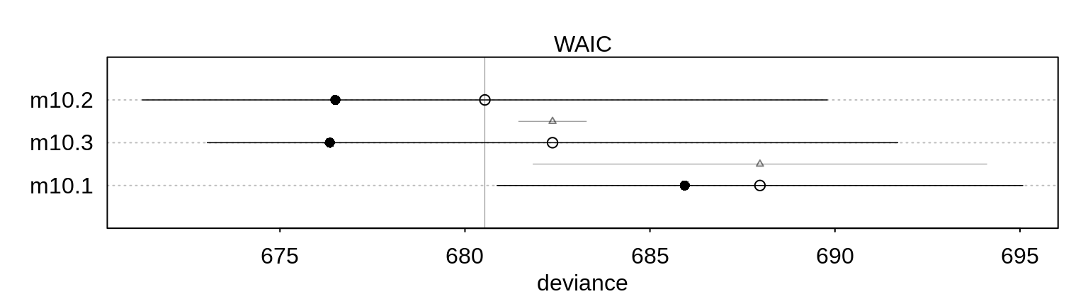
     # xlim=c( min( cp@output$WAIC - cp@output$SE) ,
    #          max(cp@output$WAIC + cp@output$SE ) ) )
Note also that the difference has a small standard error, so the order of the models wouldn’t easily change.
Let’s have a look at the third model to understand why it performs poorly compared with the second one:
precis(m10.3) mean sd 5.5% 94.5%
a 0.04771732 0.1260040 -0.1536614 0.2490961
bp 0.60967124 0.2261462 0.2482460 0.9710965
bpC -0.10396772 0.2635904 -0.5252361 0.3173006plot( precis(m10.3) )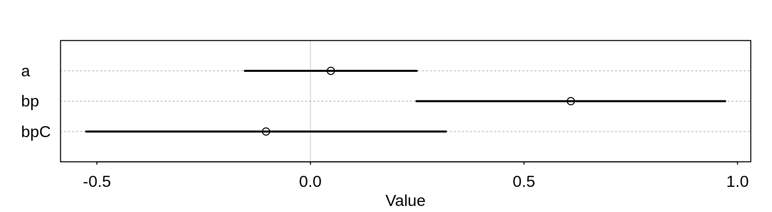
The interaction variable has a rather wide posterior.
Let’s have a closer look at the parameter bp for the effect of the prosocial option. We have to distinguish between the absolute and relative effect.
Changing the predictor prosoc_left from 0 to 1 increases the log-odds of pulling the left-hand lever by 0.61. This implies the odds are multiplied by:
exp(0.61)[1] 1.840431That is, the odds increase by 84%. This is the relative effect. The relative effect depend strongly on the other parameter als well. If we assume for example an \(\alpha\) value of 4 then the probability for a pull, ignoring everything else:
logistic(4)[1] 0.9820138is already quite high. Adding then the increase of 0.61 (relative increase of 84%) changes this to
logistic(4 + 0.61)[1] 0.9901462In this example, the absolute effect would thus be small.
Let’s plot the absolute effect:
# dummy data for predictions across treatments
d.pred <- data.frame(
  prosoc_left = c(0, 1, 0, 1), # right/left/right/left
  condition = c(0, 0, 1, 1)    # control/control/partner/partner
)

# build prediction ensemble
chimp.ensemble <- ensemble(m10.1, m10.2, m10.3, data=d.pred)

# summarize
pred.p <- apply(chimp.ensemble$link, 2, mean)
pred.p.PI <- apply(chimp.ensemble$link, 2, PI)
plot( 0, 0, type="n", xlab="prosoc_left/condition",
ylab="proportion pulled left",
ylim=c(0,1), xaxt="n", xlim=c(1,4) )
axis(1, at=1:4, labels=c("0/0", "1/0", "0/1", "1/1"))
p <- by( d$pulled_left,
list(d$prosoc_left, d$condition, d$actor ), mean)
for ( chimp in 1:7)
lines( 1:4, as.vector(p[,,chimp]),
col="royalblue4", lwd=1.5)
lines( 1:4, pred.p )
shade(pred.p.PI, 1:4)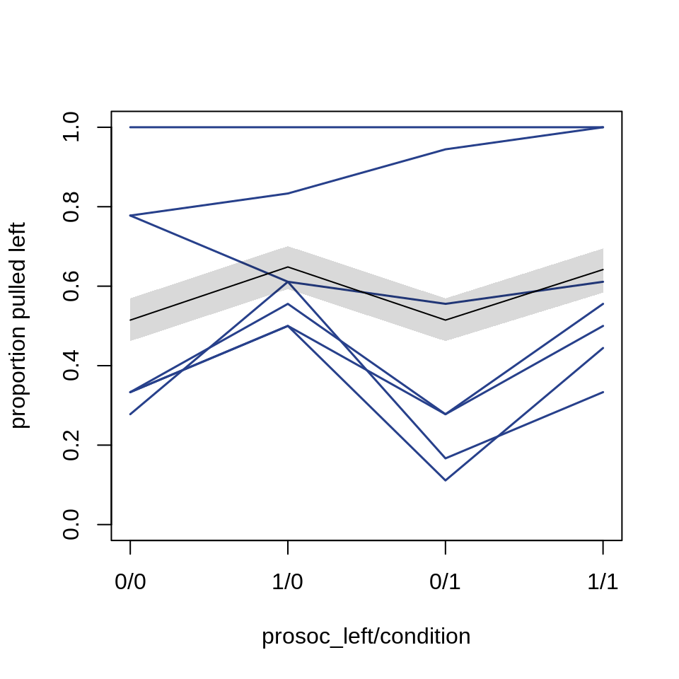
Compare the MAP model with a MCMC Stan model:
# clean NAs from the data
d2 <- d
d2$recipient <- NULL

# re-use map fit to get the formula
m10.3stan <- map2stan(m10.3, data=d2, iter=1e4, warmup=1000 )
precis(m10.3stan)
precis(m10.3stan) mean sd 5.5% 94.5% n_eff Rhat4
a 0.04976441 0.1266306 -0.1511708 0.2539383 3559.198 1.0001457
bp 0.61370030 0.2267254 0.2533023 0.9833270 3753.186 0.9999456
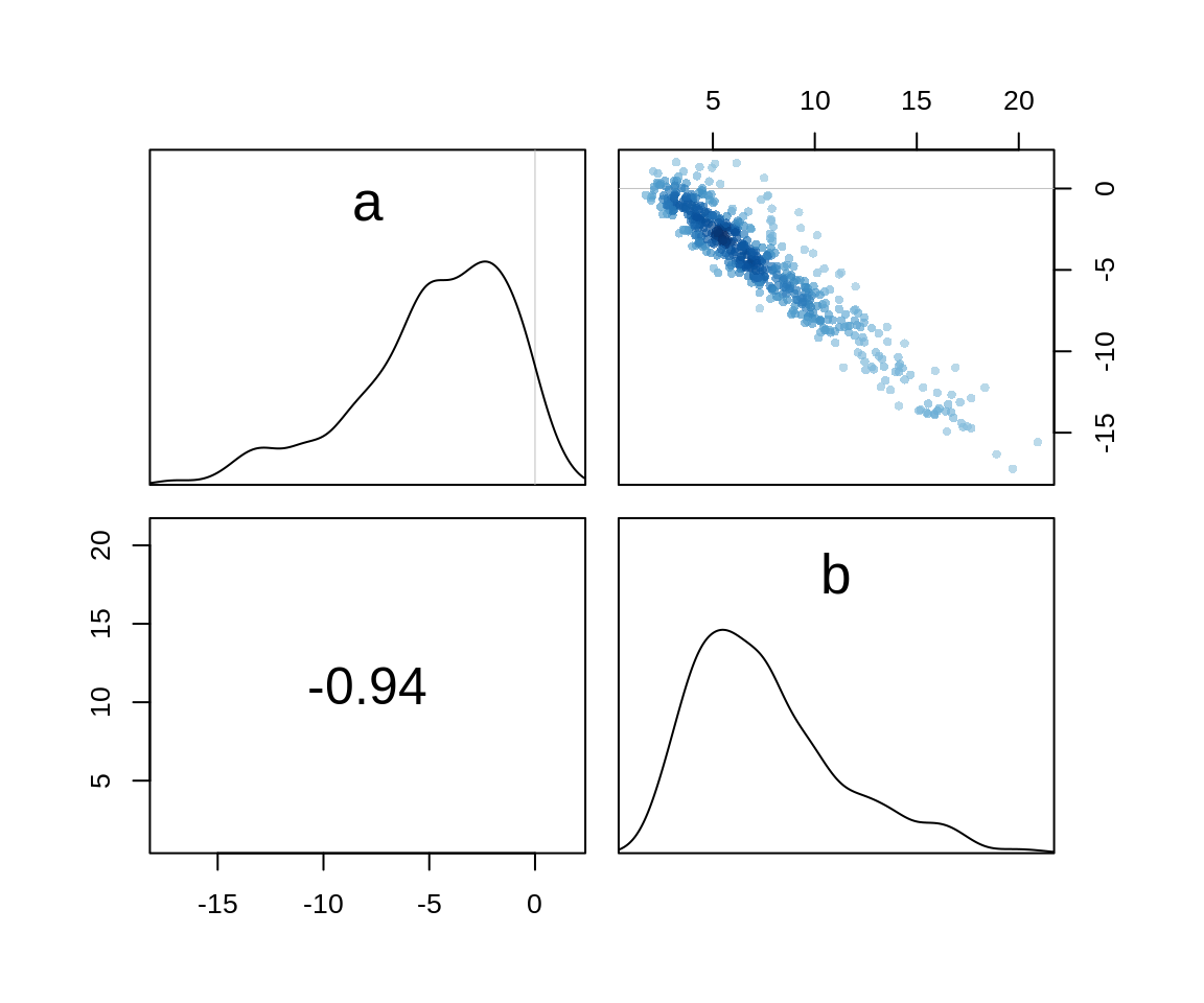
bpC -0.10605270 0.2616654 -0.5241493 0.3043651 4520.750 0.9998897The numbers are almost identical with the MAP model and we can check the pairs plot to see that the posterior is indeed well approximated by a quadratic.
pairs(m10.3stan)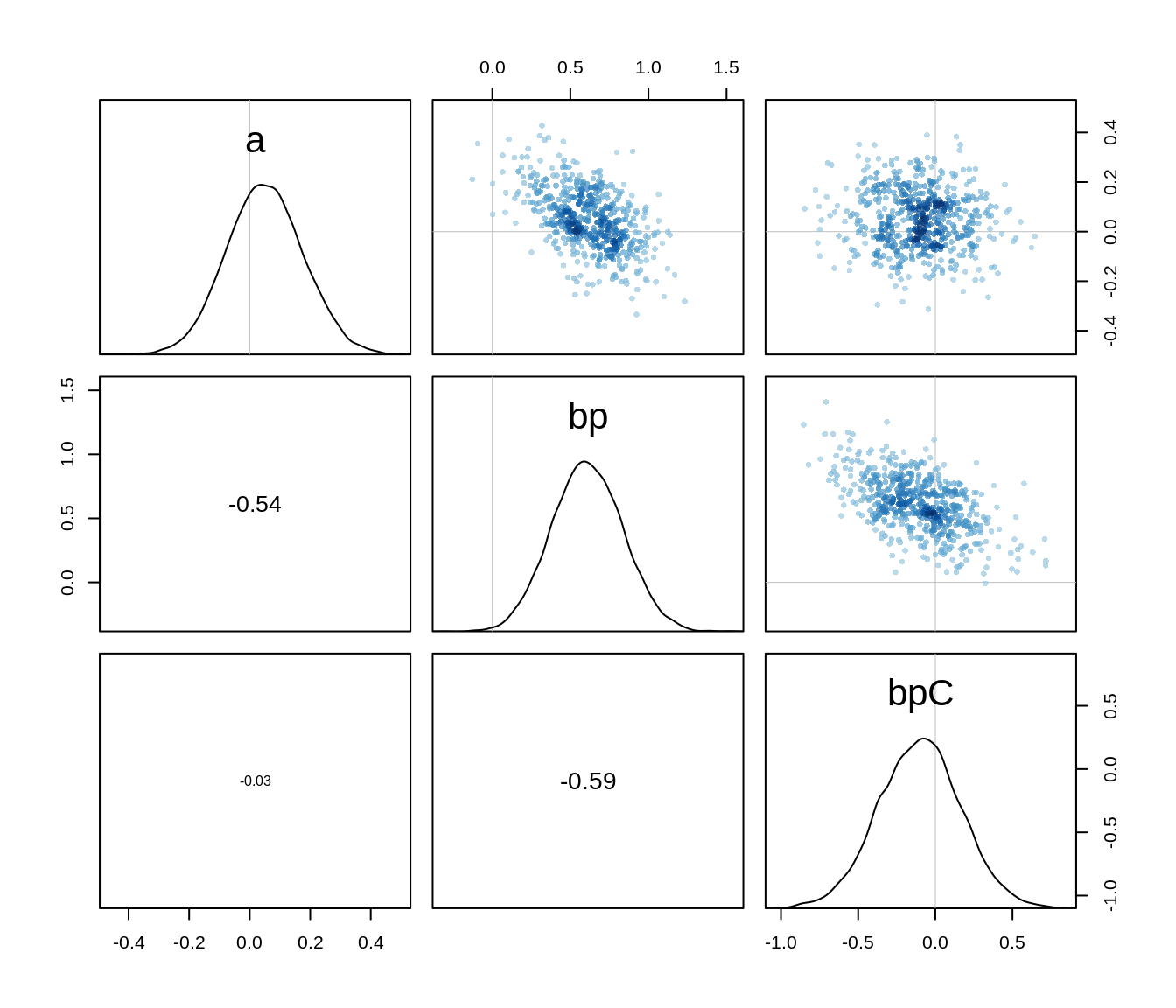
We saw in the plot of the average proportions pulled left above that some chimpanzees have a preference for pulling the left or right lever. One even always pulled the left lever. A factor here might be the handedness of the chimp. One thing we can do, is to fit an intercept for each individula: \[\begin{align*} L_i &\sim \text{Binomial}(1, p_i)\\ \text{logit}(p_i) &= \alpha_{\text{ACTOR}[i]} + (\beta_P + \beta_{PC}C_i)P_i \\ \alpha &\sim \text{Normal}(0, 10) \\ \beta_P &\sim \text{Normal}(0, 10) \\ \beta_{PC} &\sim \text{Normal}(0, 10) \end{align*}\] We fit this with MCMC since it will turn out to have some skew in its posterior distribution.
m10.4 <- map2stan(
  alist(
    pulled_left ~ dbinom(1, p),
    logit(p) <- a[actor] + (bp + bpC*condition)*prosoc_left,
    a[actor] ~ dnorm(0, 10),
    bp ~ dnorm(0, 10),
    bpC ~ dnorm(0, 10)
  ),
  data=d2, chains=2, iter=2500, warmup=500
)
Number of actors:
unique(d$actor)[1] 1 2 3 4 5 6 7precis(m10.4, depth=2) mean sd 5.5% 94.5% n_eff Rhat4
a[1] -0.7372494 0.2733713 -1.1801419 -0.2989464 3385.652 0.9999264
a[2] 11.1671670 5.5847759 4.4760880 21.5769946 1538.708 1.0011169
a[3] -1.0449858 0.2842466 -1.5009679 -0.5915931 3010.162 1.0003971
a[4] -1.0529235 0.2849536 -1.5239104 -0.6186618 2700.352 1.0010756
a[5] -0.7408384 0.2757588 -1.1794213 -0.3045947 3284.742 1.0002464
a[6] 0.2126457 0.2746675 -0.2234805 0.6527248 3253.037 0.9999860
a[7] 1.8111885 0.3937085 1.1984526 2.4777007 3128.548 1.0007682
bp 0.8336768 0.2644557 0.4241267 1.2629726 1933.664 1.0024212
bpC -0.1312570 0.3055201 -0.6221536 0.3646840 2741.259 0.9999453This posterior is not entirely Gaussian:
post <- extract.samples( m10.4)
str(post)
List of 3
$ a : num [1:4000, 1:7] -0.67 -0.599 -0.744 -0.479 -0.576 ...
$ bp : num [1:4000(1d)] 0.891 0.403 0.903 0.404 0.935 ...
$ bpC: num [1:4000(1d)] 0.30347 -0.16452 -0.13246 0.12195 -0.00634 ...dens(post$a[,2])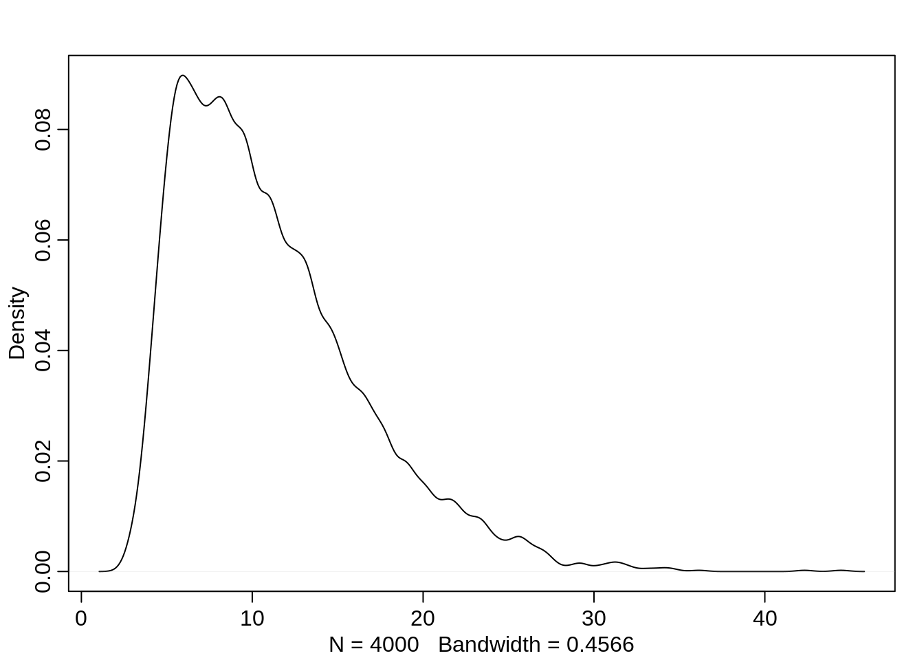
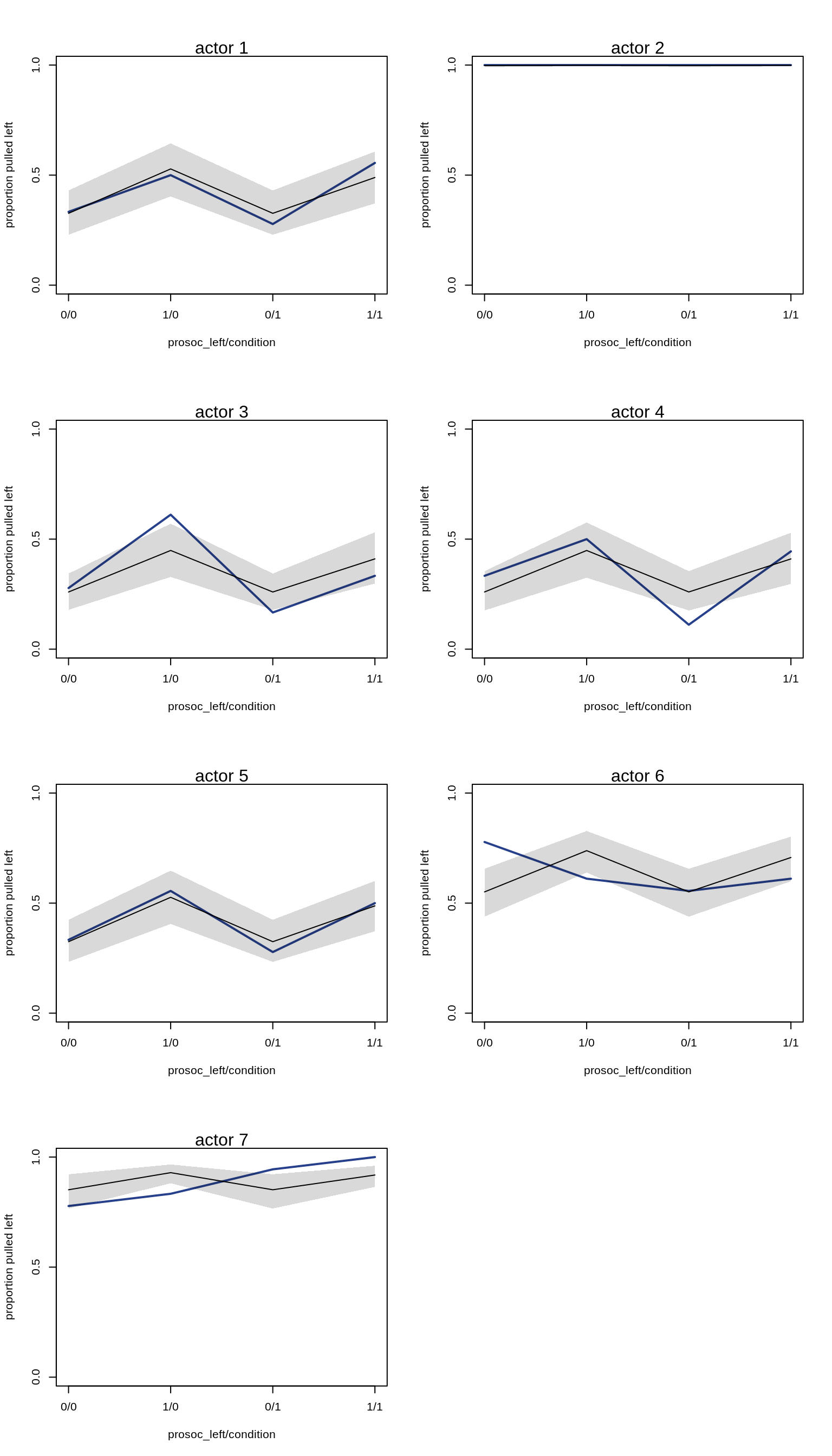
Plotting the predictions for each actor:
par(mfrow=c(4, 2))
for (chimp in 1:7) {
  d.pred <- list(
    pulled_left = rep(0, 4),       # empty outcomes
    prosoc_left = c(0, 1, 0, 1),   # right/left/right/left
    condition = c(0, 0, 1, 1),     # control/control/partner/partner
    actor = rep(chimp, 4)
  )
  link.m10.4 <- link( m10.4, data=d.pred)
  pred.p <- apply( link.m10.4, 2, mean)
  pred.p.PI <- apply( link.m10.4, 2, PI )

  plot(0, 0, type="n", xlab="prosoc_left/condition",
       ylab="proportion pulled left",
       ylim=c(0,1), xaxt="n",
       xlim=c(1, 4), yaxp=c(0,1,2) )
  axis(1, at=1:4, labels=c("0/0", "1/0", "0/1", "1/1"))
  mtext(paste( "actor", chimp ))

  p <- by( d$pulled_left,
           list(d$prosoc_left, d$condition, d$actor), mean )
  lines( 1:4, as.vector(p[,,chimp]), col="royalblue4", lwd=2)

  lines(1:4, pred.p)
  shade(pred.p.PI, 1:4)
}
Aggregated binomial
Chimpanzees
Instead of predicting the likelihood for a single pull (0 or 1), we can also predict the counts, i.e. how likely is it that an actor pulls left x times out of 18 trials.
data(chimpanzees)
d <- chimpanzees
d.aggregated <- aggregate( d$pulled_left,
                           list(prosoc_left=d$prosoc_left,
                                condition=d$condition,
                                actor=d$actor),
                           sum)
knitr::kable( head(d.aggregated, 8) )| prosoc_left | condition | actor | x |
|---|---|---|---|
| 0 | 0 | 1 | 6 |
| 1 | 0 | 1 | 9 |
| 0 | 1 | 1 | 5 |
| 1 | 1 | 1 | 10 |
| 0 | 0 | 2 | 18 |
| 1 | 0 | 2 | 18 |
| 0 | 1 | 2 | 18 |
| 1 | 1 | 2 | 18 |
m10.5 <- map(
  alist(
    x ~ dbinom( 18, p ),
    logit(p) <- a + (bp + bpC*condition)*prosoc_left,
    a ~ dnorm(0, 10),
    bp ~ dnorm(0, 10),
    bpC ~ dnorm(0, 10)
  ),
  data = d.aggregated
)
precis(m10.5)
mean sd 5.5% 94.5%
a 0.04771725 0.1260040 -0.1536615 0.2490960
bp 0.60967148 0.2261462 0.2482462 0.9710968
bpC -0.10396791 0.2635904 -0.5252363 0.3173004Compare with the same model with non-aggregated data:
precis(m10.3stan) mean sd 5.5% 94.5% n_eff Rhat4
a 0.04976441 0.1266306 -0.1511708 0.2539383 3559.198 1.0001457
bp 0.61370030 0.2267254 0.2533023 0.9833270 3753.186 0.9999456
bpC -0.10605270 0.2616654 -0.5241493 0.3043651 4520.750 0.9998897We get the same estimates.
Graduate school admissions
data("UCBadmit")
d <- UCBadmit
knitr::kable(d)| dept | applicant.gender | admit | reject | applications |
|---|---|---|---|---|
| A | male | 512 | 313 | 825 |
| A | female | 89 | 19 | 108 |
| B | male | 353 | 207 | 560 |
| B | female | 17 | 8 | 25 |
| C | male | 120 | 205 | 325 |
| C | female | 202 | 391 | 593 |
| D | male | 138 | 279 | 417 |
| D | female | 131 | 244 | 375 |
| E | male | 53 | 138 | 191 |
| E | female | 94 | 299 | 393 |
| F | male | 22 | 351 | 373 |
| F | female | 24 | 317 | 341 |
The data set contains only 12 rows but since it is aggregated, it actually represents 4526 applications. The goal is to evaluate whether the data contains evidence for gender bias in admission.
We will fit two models: One using gender as a predictor for admit and one modelling admit as a constant, ignoring gender.
d$male <- ifelse( d$applicant.gender == "male", 1, 0 )

m10.6 <- map(
  alist(
    admit ~ dbinom( applications, p ),
    logit(p) <- a + bm*male,
    a ~ dnorm(0, 10),
    bm ~ dnorm(0, 10)
  ),
  data=d
)

m10.7 <- map(
  alist(
    admit ~ dbinom( applications, p),
    logit(p) <- a,
    a ~ dnorm(0, 10)
  ),
  data=d
)
(cp <- compare( m10.6, m10.7 ) ) WAIC SE dWAIC dSE pWAIC weight
m10.6 977.7285 306.6545 0.00000 NA 105.18299 1.000000e+00
m10.7 1045.9614 313.3881 68.23294 163.0158 87.29271 1.525476e-15The model using male as a predictor performs better than without. The comparison suggests that gender actually matters a lot:
plot( cp)# , 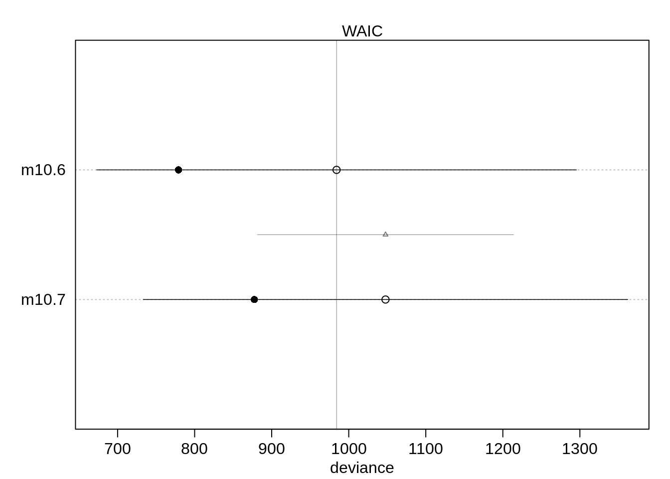
     # xlim=c( min( cp@output$WAIC - cp@output$SE) ,
      #        max(cp@output$WAIC + cp@output$SE ) ) )
In which way does it matter?
precis( m10.6 ) mean sd 5.5% 94.5%
a -0.8304494 0.05077041 -0.9115904 -0.7493085
bm 0.6103063 0.06389095 0.5081962 0.7124164Being male does improve the chances of being admitted.
The relative difference is exp(0.61) = 1.8404314. This means that a male applicant’s odds are 184% of a female applicant.
Let’s get the absolute scale, which is more important:
post <- extract.samples( m10.6 )
p.admit.male <- logistic( post$a + post$bm )
p.admit.female <- logistic( post$a )

diff.admit <- p.admit.male - p.admit.female

quantile( diff.admit, c(0.025, 0.5, 0.975 ))
2.5% 50% 97.5%
0.1132664 0.1415654 0.1702002 Thus the median estimate of the male advantage is about 14%.
dens( diff.admit )
postcheck( m10.6, n=1e4 , col="royalblue4")

# draw lines connecting points from same dept
for ( i in 1:6 ){
  x <- 1 + 2*(i-1)
  y1 <- d$admit[x]/d$applications[x]       # male
  y2 <- d$admit[x+1]/d$applications[x+1]   # female
  lines( c(x, x+1), c(y1, y2), col="royalblue4", lwd=2)
  text(x+0.5, (y1 + y2)/2 + 0.05, d$dept[x], cex=0.8, col="royalblue4")
}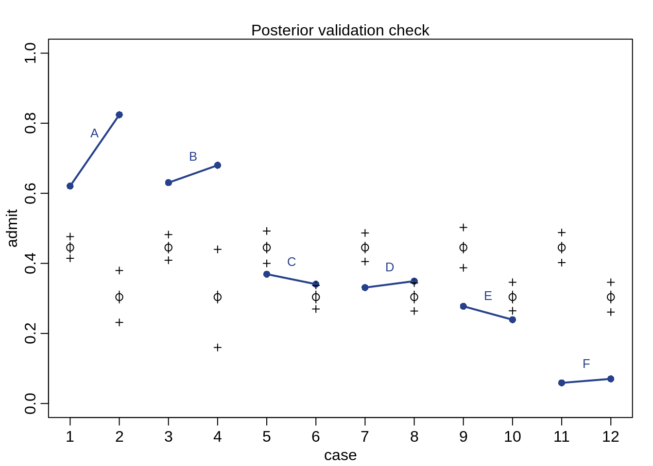
The first point of a line is the admission rate for males while the second point of a line is the admission rate for females. The expeted predictions are the black open points and the black crosses indicate the 89% interval of the expectations. The plot shows that only two departments (C and E) and lower admission rates for females. How come we get such a bad prediction?
The problem: Male and female applicants don’t apply to the same departments and departments have different admission rates. Department A has much higer admission rates than department F and female applicants apply more often to F than to A.
We will build a model that uses a unique intercept per department.
# make index
d$dept_id <- coerce_index( d$dept )

# model with unique intercept for each dept
m10.8 <- map(
  alist(
    admit ~ dbinom( applications, p),
    logit(p) <- a[dept_id],
    a[dept_id] ~ dnorm(0, 10)
  ),
  data=d
)

m10.9 <- map(
  alist(
    admit ~ dbinom( applications, p),
    logit(p) <- a[dept_id] + bm*male,
    a[dept_id] ~ dnorm(0, 10),
    bm ~ dnorm(0, 10)
  ),
  data=d
)
We then compare all three models:
(cp <- compare( m10.6, m10.7, m10.8, m10.9 ) ) WAIC SE dWAIC dSE pWAIC weight
m10.8 104.7375 17.08848 0.000000 NA 6.307905 8.946839e-01
m10.9 109.0165 16.14685 4.279009 3.141234 9.717673 1.053161e-01
m10.6 1004.2497 318.52333 899.512183 329.661575 116.904700 4.217751e-196
m10.7 1038.3364 310.98958 933.598934 322.554303 81.271416 1.672003e-203As a plot:
plot( cp )#, 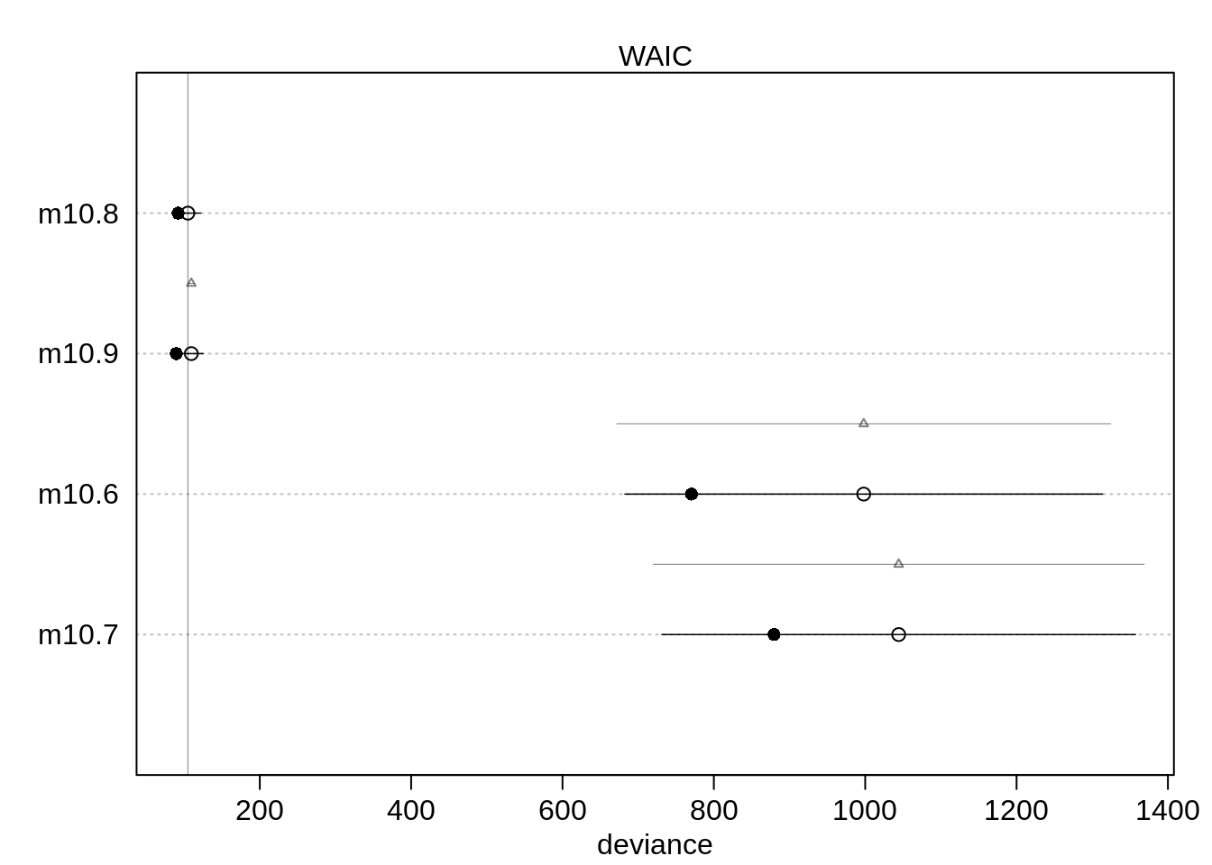
      #xlim=c( min( cp@output$WAIC - cp@output$SE) ,
       #       max(cp@output$WAIC + cp@output$SE ) ) )
The two new models with the unique intercepts perform much better. Now, the model without male is ranked first but the difference between the first two models is tiny. Both models got about half the Akaike weight so you could call it a tie.
So how does gender now affect admission?
precis( m10.9, depth=2 ) mean sd 5.5% 94.5%
a[1] 0.68193889 0.09910200 0.5235548 0.84032303
a[2] 0.63852985 0.11556510 0.4538345 0.82322521
a[3] -0.58062940 0.07465092 -0.6999360 -0.46132281
a[4] -0.61262184 0.08596001 -0.7500025 -0.47524113
a[5] -1.05727073 0.09872297 -1.2150491 -0.89949235
a[6] -2.62392132 0.15766770 -2.8759048 -2.37193787
bm -0.09992558 0.08083548 -0.2291163 0.02926513The estimate for bm has changed direction, meaning it now estimates that being male is a disadvantage! The estimate becomes exp(-0.1) = 0.9048374. So a male has about 90% the odds of admission as a female.
Let’s do the posterior check again as before:
postcheck( m10.9, n=1e4 , col="royalblue4")

# draw lines connecting points from same dept
for ( i in 1:6 ){
  x <- 1 + 2*(i-1)
  y1 <- d$admit[x]/d$applications[x]       # male
  y2 <- d$admit[x+1]/d$applications[x+1]   # female
  lines( c(x, x+1), c(y1, y2), col="royalblue4", lwd=2)
  text(x+0.5, (y1 + y2)/2 + 0.05, d$dept[x], cex=0.8, col="royalblue4")
}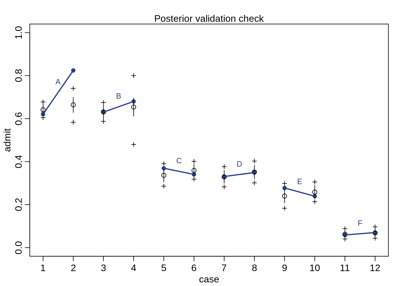
The predictions fit much better than before.
Let’s also check the quadratic approximation. In the example with the chimpanzees, unique intercepts were a problem for quadratic approximations, so let’s check how the compare to a Stan model:
dstan <- d[, c("admit", "applications", "male", "dept_id")]
m10.9stan <- map2stan( m10.9, data=dstan,
                       chains=2, iter=2500, warmup=500)
precis(m10.9stan, depth=2)
pairs(m10.9stan)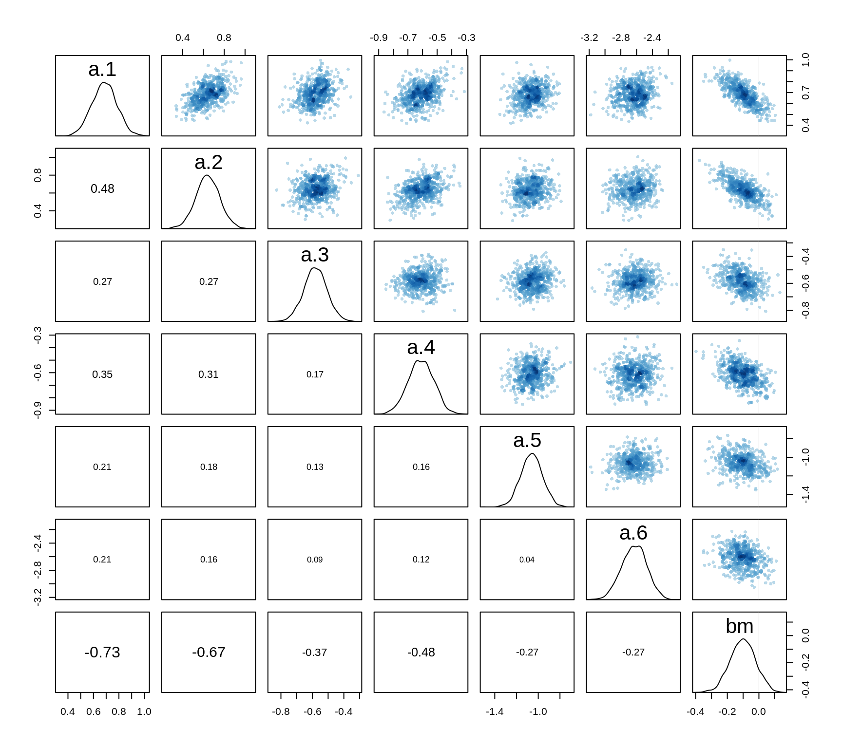
All the posterior distributions are pretty much Gaussian, a quadratic approximation thus gives good estimates.
Fitting binomial regression with glm
The following code yields similar results as the map approach for the aggregated binomial.
m10.7glm <- glm( cbind( admit, reject) ~ 1, data=d, family=binomial)
m10.6glm <- glm( cbind( admit, reject) ~ male, data=d, family=binomial)
m10.8glm <- glm( cbind( admit, reject) ~ dept, data=d, family=binomial)
m10.9glm <- glm( cbind( admit, reject) ~ male + dept, data=d,
                 family=binomial )
precis(m10.9glm)
mean sd 5.5% 94.5%
(Intercept) 0.68192148 0.09911270 0.5235203 0.84032272
male -0.09987009 0.08084647 -0.2290784 0.02933818
deptB -0.04339793 0.10983890 -0.2189417 0.13214584
deptC -1.26259802 0.10663289 -1.4330180 -1.09217808
deptD -1.29460647 0.10582342 -1.4637327 -1.12548020
deptE -1.73930574 0.12611350 -1.9408595 -1.53775201
deptF -3.30648006 0.16998181 -3.5781438 -3.03481630Compare with the map() model:
precis(m10.9stan, depth=2) mean sd 5.5% 94.5% n_eff Rhat4
a[1] 0.68246617 0.09905564 0.5201021 0.83810520 2420.895 0.9995347
a[2] 0.63745932 0.11432391 0.4524364 0.82390122 2554.566 0.9999047
a[3] -0.58261668 0.07439702 -0.7025880 -0.46510662 3464.430 0.9995155
a[4] -0.61495490 0.08741428 -0.7562219 -0.47655593 2946.395 1.0000812
a[5] -1.05793749 0.09926122 -1.2166197 -0.89944976 3232.371 1.0002706
a[6] -2.63357331 0.15116106 -2.8788143 -2.39495133 3287.971 0.9999513
bm -0.09868678 0.08056245 -0.2286651 0.02687807 2063.772 0.9995024Note that the departments are coded differently: the intercept in the glm model corresponds to a[1] in the Stan model and deptB in the glm model corresponds to the difference from department A to B, that is a[2]-a[1] in the Stan model.
To use glm() for a non-aggregated model:
m10.4glm <- glm(
  pulled_left ~ as.factor(actor) + prosoc_left*condition  -condition,
  data=chimpanzees, family=binomial
)
precis(m10.4glm)
mean sd 5.5% 94.5%
(Intercept) -7.265827e-01 0.2686406 -1.1559223 -0.2972432
as.factor(actor)2 1.894908e+01 754.9798310 -1187.6545076 1225.5526659
as.factor(actor)3 -3.049664e-01 0.3500257 -0.8643751 0.2544423
as.factor(actor)4 -3.049664e-01 0.3500257 -0.8643751 0.2544423
as.factor(actor)5 -2.705907e-15 0.3440353 -0.5498348 0.5498348
as.factor(actor)6 9.395168e-01 0.3489007 0.3819061 1.4971274
as.factor(actor)7 2.483652e+00 0.4506924 1.7633580 3.2039450
prosoc_left 8.223656e-01 0.2613048 0.4047500 1.2399812
prosoc_left:condition -1.323906e-01 0.2971937 -0.6073635 0.3425823We need to use -condition to remove the main effect of condition.
We can also use glimmer() to get code corresponding to a map or map2stan model.
glimmer( pulled_left ~ prosoc_left*condition -condition,
         data=chimpanzees, family=binomial)
alist(
pulled_left ~ dbinom( 1 , p ),
logit(p) <- Intercept +
b_prosoc_left*prosoc_left +
b_prosoc_left_X_condition*prosoc_left_X_condition,
Intercept ~ dnorm(0,10),
b_prosoc_left ~ dnorm(0,10),
b_prosoc_left_X_condition ~ dnorm(0,10)
)Note that glm uses flat priors by default which can lead to nonsense estimates. Consider for example the following example:
# almost perfectly associated
y <- c( rep(0, 10), rep(1, 10))
x <- c(rep(-1, 9), rep(1, 11))
m.bad <- glm( y ~ x, data=list(x=x, y=y), family=binomial)
precis(m.bad)
mean sd 5.5% 94.5%
(Intercept) -9.131742 2955.062 -4731.891 4713.628
x 11.434327 2955.062 -4711.325 4734.194The estimates would suggest there is no association between x and y even though there is a strong association. A weak prior helps:
m.good <- map(
  alist(
    y ~ dbinom(1, p),
    logit(p) <- a + b*x,
    a ~ dnorm(0, 10),
    b ~ dnorm(0, 10)
  ),
  data=list(x=x, y=y)
)
precis(m.good)
mean sd 5.5% 94.5%
a -1.727022 2.776206 -6.1639353 2.709892
b 4.017533 2.776206 -0.4193806 8.454447Since the uncertainty is not symmetric in this case, the quadratic assumption is misleading. Even better would be MCMC samples:
m.better <- map2stan( m.good)
pairs(m.better)