I recently participated in a hackathon organised by EU’s anti-disinformation task force where they gave us access to their data base. The data base consists of all disinformation cases the group has collected since it started in 2015. Their data can also be browsed online on their web page www.euvsdisinfo.eu. The data contains more than 7000 cases of disinformation, mostly news articles and videos, that were collected and debunked by the EUvsDisinfo project. I built a small R package that makes it easier to download the data from their API (it seems though that the API is currently not updated as regularly as their web page). This data though does not contain the articles or videos themselves but only an URL to where the piece originally appeared together with a short summary of the claim made, why it’s not true, and some other meta data, such as language and countries targeted. So I went ahead and scraped the original articles, both the raw html and just a text version, extracted from the html. If you want to play with the data yourself, it’s all uploaded on kaggle. For this post, I use both the html-files and the csv-file containing the meta data.
When I was scraping and checking the data, I saw some Google Analytics IDs which made me wonder if it might be possible to use analytics IDs to identify connections between different disinformation outlets. Some Outlets, such as Sputnik, have multiple outlets for different countries (there are 30 different outlets in the data with “sputnik” in the name). Others might be run by the same organization without disclosing this. Now, I don’t expect to find many of these, after all, it seems like a mistake that can easily be avoided but even finding only a handful connections could be useful. Also, it’s a nice opportunity to try out some R network packages.
Preparing the data
First, we’ll need to get the analytic IDs from the html. Luckily, the analytics apps usually provide code snippets for copy-pasting so we can expect the code to always follow the same pattern. For Google Analytics, the part of its code snippet we’re most interested in, is the following line:
ga('create', 'UA-XXXXX-Y', 'auto');where UA-XXXXX-Y is the account ID. One account can have multiple IDs associated with it which then get counted up in the Y part, so we’re really only interested in the XXXXX part. To extract this part, I’m using the function str_extract_all from the stringr package and some elaborate regex. I won’t go into the details of the regex but my approach was to basically paste the html text to regex101.com and use some trial-and-error until I got the results I wanted (btw clipr::write_clip(htmltext) is a handy function to copy-paste the html text to the clipboard). One thing to take into account when using regex101.com is that in R we need to escape any backslashes. That is, if on regex101.com we use \( to match (, we need to escape the slash in R and write \\(. To match \ we would write \\ in regex101.com and have to doubly escape the slashes in R: \\\\ matches one \ in R. The function to extract the Google Analytics ID then looks like this:
ga_id <- function(htmltext) {
  str_extract_all(htmltext,  "(?<=ga\\('create',\\s')(UA-\\d+)(?=-\\d+)") %>%
    flatten_chr() %>%
    unique
}
We can do the same for a bunch of other common IDs and combine them in one function:
compute_ids <- function(html_file) {
  html <- read_html(html_file, encoding="UTF-8")
  htmltext <- as.character(html)
  ga <- ga_id(htmltext)
  gad <- google_ad_id(htmltext)
  ya_m <- ya_metrika(htmltext)
  fb <- fb_pixel(htmltext)
  ya_a <- ya_ads(htmltext)
  tibble(htmlfile = basename(html_file),
         ga = list(ga),
         google_ad = list(gad),
         ya_metrika = list(ya_m),
         fb_pixel = list(fb),
         ya_ad = list(ya_a))
}
After computing this for every file and merging it with the meta data we get a data frame where each row corresponds to one article for which we extracted tracking IDs. We can use then this to compute edges connecting the outlet organizations.
| id | ga | google_ad | ya_metrika | fb_pixel | ya_ad | organization_id |
|---|---|---|---|---|---|---|
| news_articles_1000 | UA-63883919 | ca-pub-8386451025337892 | 35327630 | /organizations/205 | ||
| news_articles_1001 | UA-63883919 | ca-pub-8386451025337892 | 35327630 | /organizations/205 | ||
| news_articles_1002 | UA-91750496 | ca-pub-2594699865181708 | 16666762 | /organizations/355 |
Creating Edges
To build the network, we need to create edges between organizations that use the same ID. The IDs are saved in columns of lists (there could be more than one ID per type per news article) so we first unnest the lists, keep only distinct IDs per organization and then join the data frame with itself. We do this for each ID type. For the Google Analytics ID, this looks as follow:
org_nodes <- data %>%
  unnest(ga) %>%
  group_by(organization_id) %>%
  distinct(ga)

org_edges <- org_nodes %>%
  inner_join(org_nodes, by="ga") %>%
  filter(organization_id.x != organization_id.y) %>%
  mutate(label = "ga") %>%
  select(from = organization_id.x, to = organization_id.y, label)
We only keep the rows with distinct organizations but we also need to check for duplicate pairs. That is, an edge from organization A to organization B is the same as an edge from organization B to organization A. This was a bit tricky and I solved the problem by sorting the column content (so that organization A always appears before organization B in a row) and then removing duplicates. My solution isn’t particularly tidy, I guess one could use pivoting for a tidy approach but this one felt more straight-forward to me.
org_edges[c("from", "to")] <- t(apply(org_edges[c("from", "to")], 1, sort))
dupls <- duplicated(org_edges)
org_edges <- org_edges[!dupls, ]
We put this all in a function make_edge_list() and apply it for each of the ID types.
org_nodes <- df %>%
  group_by(organization_id, organization_name) %>%
  count()

org_edges <- bind_rows( make_edge_list(ga),
           make_edge_list(google_ad),
           make_edge_list(ya_metrika),
           make_edge_list(fb_pixel),
           make_edge_list(ya_ad) ) %>%
distinct(from, to, label, .keep_all = TRUE)| from | to | label |
|---|---|---|
| /organizations/126 | /organizations/219 | ga |
| /organizations/219 | /organizations/908 | ga |
| /organizations/219 | /organizations/342 | ga |
Each row in this data frame represents one edge between two organizations (that is, organizations that use the same ID). Notice that there can be multiple edges between two organizations. This happens when they share IDs of different type, e.g. the same Google Analytics ID as well as the same Facebook Pixel ID.
Making the graph
Last time I was working with graphs in R was for my master thesis and back then I was extensively using the package igrah. It is very comprehensive but getting the knack of it takes some time. While plotting is straight-forward, it is not as easy to get nice looking plots and one needs to do quite a bit of manual tweaking for features such as coloring by a category (at least last time I checked). Also, it uses base plot which I personally find more difficult to modify to my needs.
But now there is tidygraph and ggraph which provide a tidy interface for igraph and as well as a ggplot extension for graphs.
First, we create the graph object from the edge data frame. It’s actually not necessary to provide the nodes data frame as well since it can deduce nodes from the edges. This is however useful if you have additional data columns for your nodes or if you have some single nodes that are not connected via edges.
org_graph <- tbl_graph(edges = org_edges, directed = FALSE, nodes = org_nodes)To work with this tidy graph, it is important to keep in mind that we basically have two data frames behind it. Depending on what we want to do, we have to work with either the nodes or the edges. To compute centrality measures such as the degree or betweenness of a node, we work with the nodes data frame. To query information about edges such as weather an edge is multiple (here, these are organizations that share the same ID for more than one ID type), we work with the edge data frame. To switch between the two contexts, tidygraph provides the function activate().
In the following code, we compute a few centrality metrics (useful for plotting later), compute the component sizes by grouping by components first and then filter out any single nodes.
org_graph <- org_graph %>%
  activate(nodes) %>%
  mutate(degree = centrality_degree(),
         centrality = centrality_betweenness() + 1,
         component = group_components() %>%
           factor()) %>%
  group_by(component) %>%
  # filter out single nodes
  mutate(comp_size = n(),
         larg_com = comp_size > 2) %>%
  filter(comp_size > 1) %>%
  ungroup()
If we want to extract the data frames back from the graph object, we can do as follows:
edges <- org_graph %>%
  activate(edges) %>%
  as_tibble
Visualizing
Let’s get to the most fun part of this analysis: visualizing the network! In a way, a moment of suspense since it will show if there are actually some interesting network structures of organizations linked by IDs or not.
The package ggraph is an extension of ggplot and thus has a very similar interface. However, since we’re still dealing with two underlying data sets (the nodes and the edges), we also have to specify for the geoms if they should use the nodes or edges data.
If we specify aesthetics, such as color, for either nodes or edges, we also need to specify this information when using a scale function. To e.g. color the edges we need to use scale_edge_color_*() whereas scale_color_*() specifies by default the coloring scale for the nodes.
ggraph(org_graph, layout = "auto") +
  geom_edge_fan(aes(color=label)) +
  geom_node_point(aes(size=sqrt(centrality)), show.legend = F) +
  scale_edge_color_brewer(palette = "Set1") + labs(edge_color="") +
  scale_size(range = c(1.5, 8)) +
  theme_graph()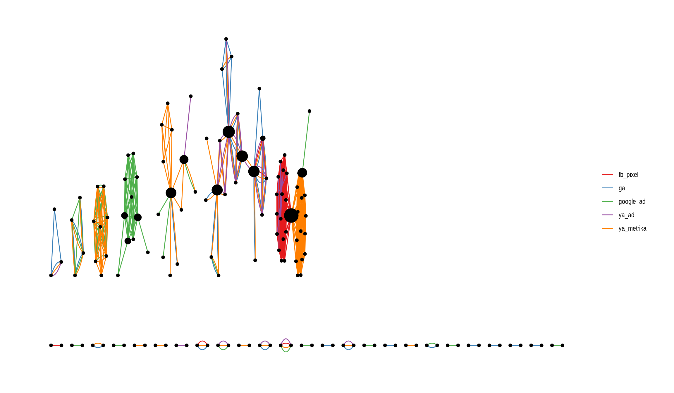
While the familiar ggplot interface makes it easy to modify the aesthetics of the graph, it doesn’t look yet very pleasing. On one hand, there are many components with only two nodes and also, the arrangement of the network doesn’t seem optimal.
For the visualization, we can opt to only display components with more than two nodes but even then the remaining components look very compressed. I find this the most difficult part in getting a network look pretty: picking the right layout. There are dozens of different layouts, many with a range of parameters as well, each one trying to optimize slightly different aspects. igraph alone provides more than a dozen layouts which are listed at ?layout_tbl_graph_igraph. My partner jokingly accused me of p-hacking my graph when I was trying out all the different layouts to decide which one fits best. For this graph, I found the Fruchterman-Reingold layout to work best which can be used by setting ggraph(org_graph, layout = "fr").
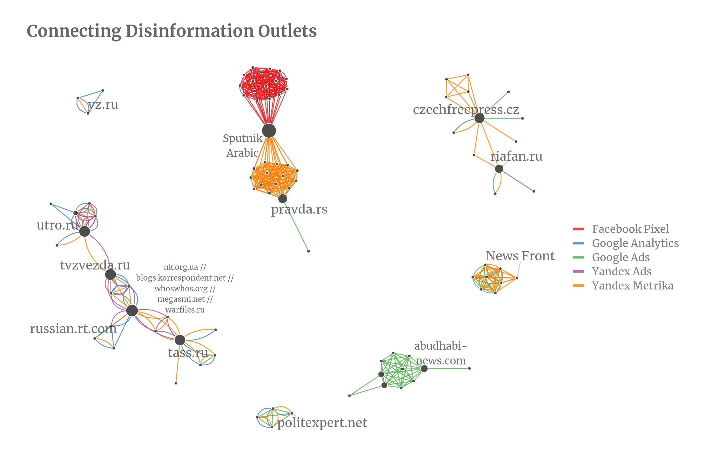
I added some labels of nodes with a high betweenness (the betweenness of a node roughly measures how many nodes are connected through this node). The biggest component with 33 nodes is the Sputnik network. Almost all of them have Sputnik in their organization name and thus also belong officially together. I would have expected for them to form a fully connected network and found it interesting that they split neatly into two parts, one using Yandex Metrika and the other using Google Analytics and Facebook Pixel. One possible explanation could be that one half of the web page have an audience that is more prone to using Facebook. Another almost fully connected network consists of organizations for an Arabic audience and are exclusively connected by Google Ads IDs. A smaller close to fully connected network contains various News Front outlets.
Now, I would expected that all components would be close to fully connected or at least similar to the Sputnik network but the second and third largest networks are only loosely connected: The network containing russian.rt.com consists of 20 nodes and the one with riafan.ru of 13 nodes but they both have much lower average degree of around 3 whereas the average degree for the Sputnik component has an average degree of 15.6 (not counting multi-edges).
Interactive networks
Ideally, to further analyze the network it would be great to have some kind of interactivity where we could at least hover over the nodes to get the organization names. The easiest solution to this would be using plotly on top of the ggplot graph but unfortunately there is no support yet for the ggraph geoms in plotly.
Instead, we can use the package networkD3 which creates a D3 network graph. The resulting graphs look very pretty but unfortunately the package is more restricted in its option than ggraph. For example, multi-edges are not possible, coloring edges can only be done manually and I haven’t found a way to get a legend for the manually colored edges. The color scheme is the same as above so except for the missing multi-edges it is the same plot as above. I also added the two node components back in.
library(networkD3)
set1 <- brewer.pal(length(unique(edges$label)), "Set1")
# d3 starts with 0 so need to move the index
nodes_d3 <- mutate(nodes, id=id-1,
                   group = "1",
                   label = str_wrap(label, width=10))

edges_d3 <- edges %>%
  mutate(from=from-1, to=to-1) %>%
  mutate(col = set1[as.factor(label)])

forceNetwork(Links = as.data.frame(edges_d3), Nodes = as.data.frame(nodes_d3),
             Source="from", Target="to",
             NodeID = "label", Group = "group", Nodesize="centrality",
             opacity = 0.9, fontSize=16, zoom = TRUE, charge=-10,
             linkColour = edges_d3$col, bounded = T,
             height=900, width = 900, opacityNoHover = 0)